Case Study: CampFam
camp booking website
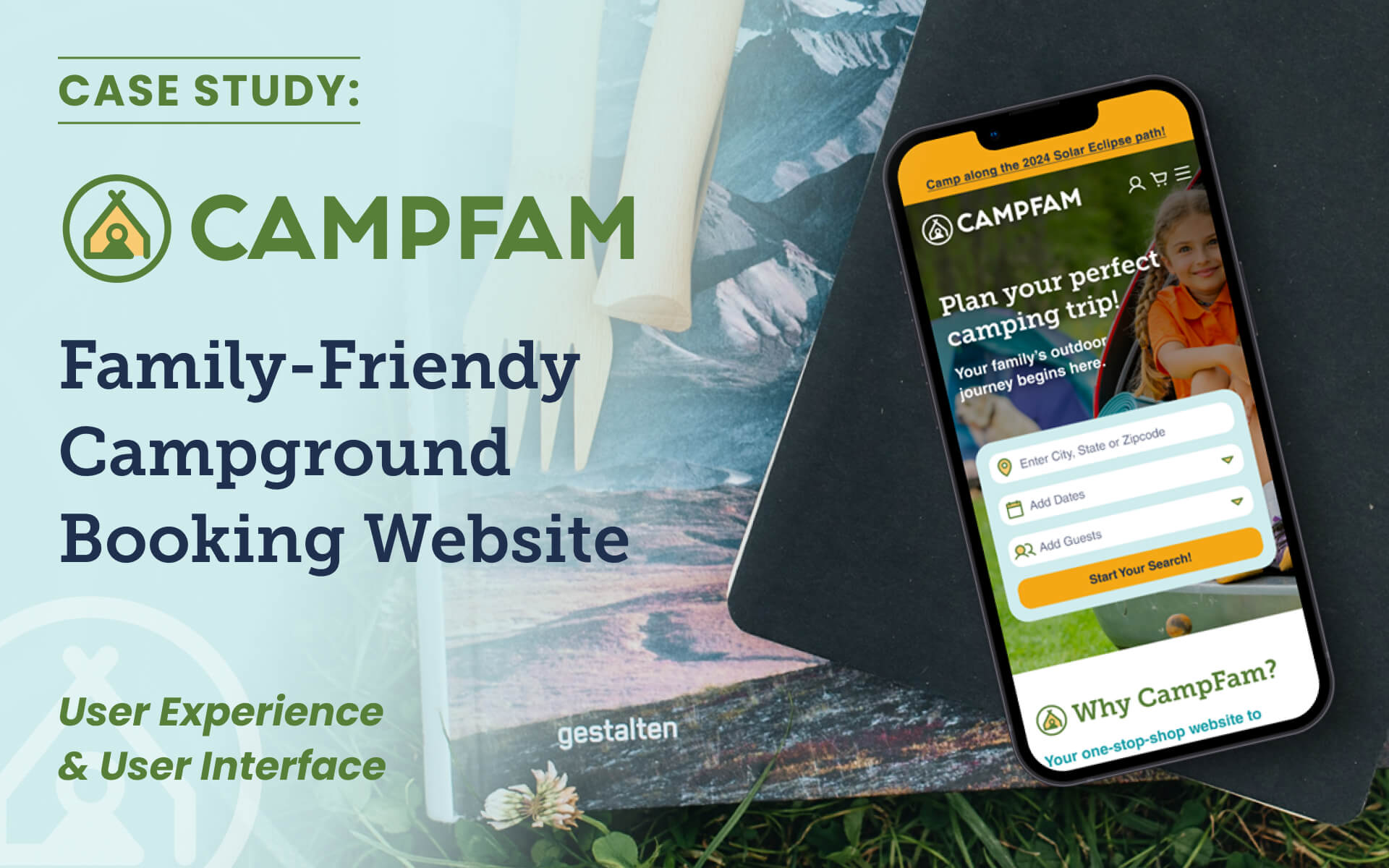
Overview: UX/UI Design of a potential website for booking family-friendly campgrounds. Created for User Interface Immersion course at CareerFoundry.
Quicklinks: Project Brief | Tasks | Competitors | Interviews | Personas | User Flow | Style Guide | Wireframes | Breakpoints | Summary
project brief:
Design a responsive website for reserving public and private campsites in the U.S., aimed at families with kids.
tasks:
1. Research the User Experience of families looking for a place to camp.
2. Use that data
to design the User Interface for all device sizes (starting with a mobile-first approach).
3. Prepare assets for hand-off to web-developers.
competitor research:
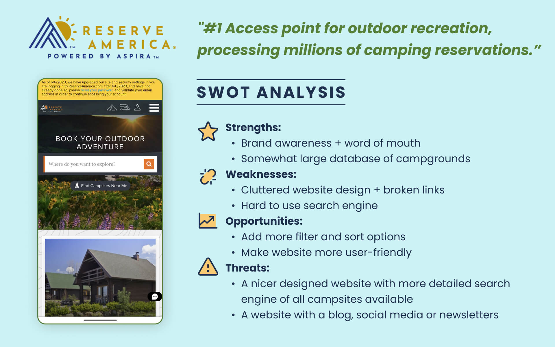
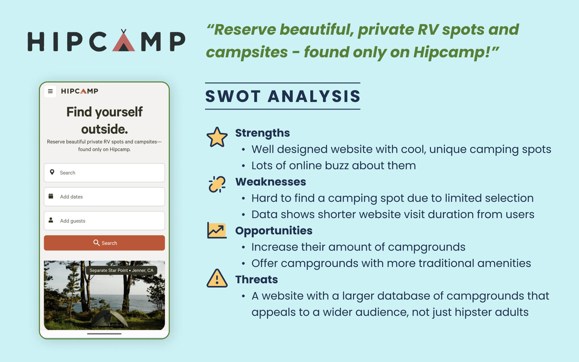
As part of researching the potential User Experience on CampFam, an analysis was completed on two real-world competitor websites: ReserveAmerica.com and Hipcamp.com.
user interviews:
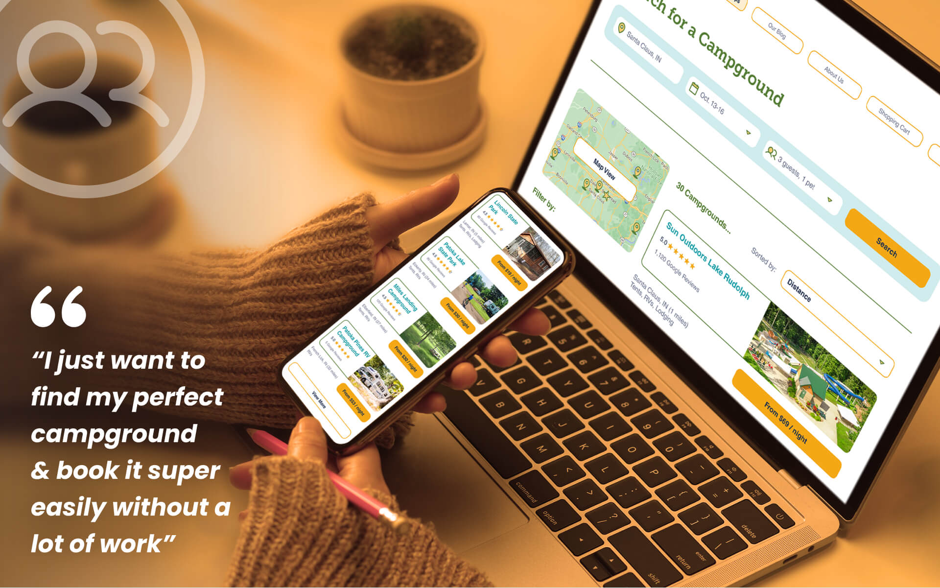
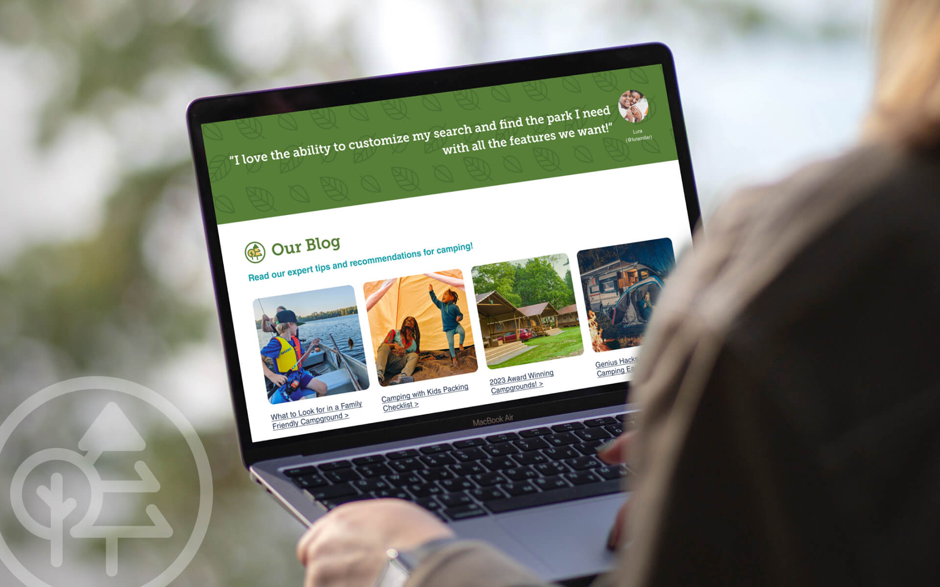
Interviews were conducted with adults age 25-55 who want to go camping with their children. Results showed everyone wants one easy website to search ALL campgrounds and find just the right one.
user personas:
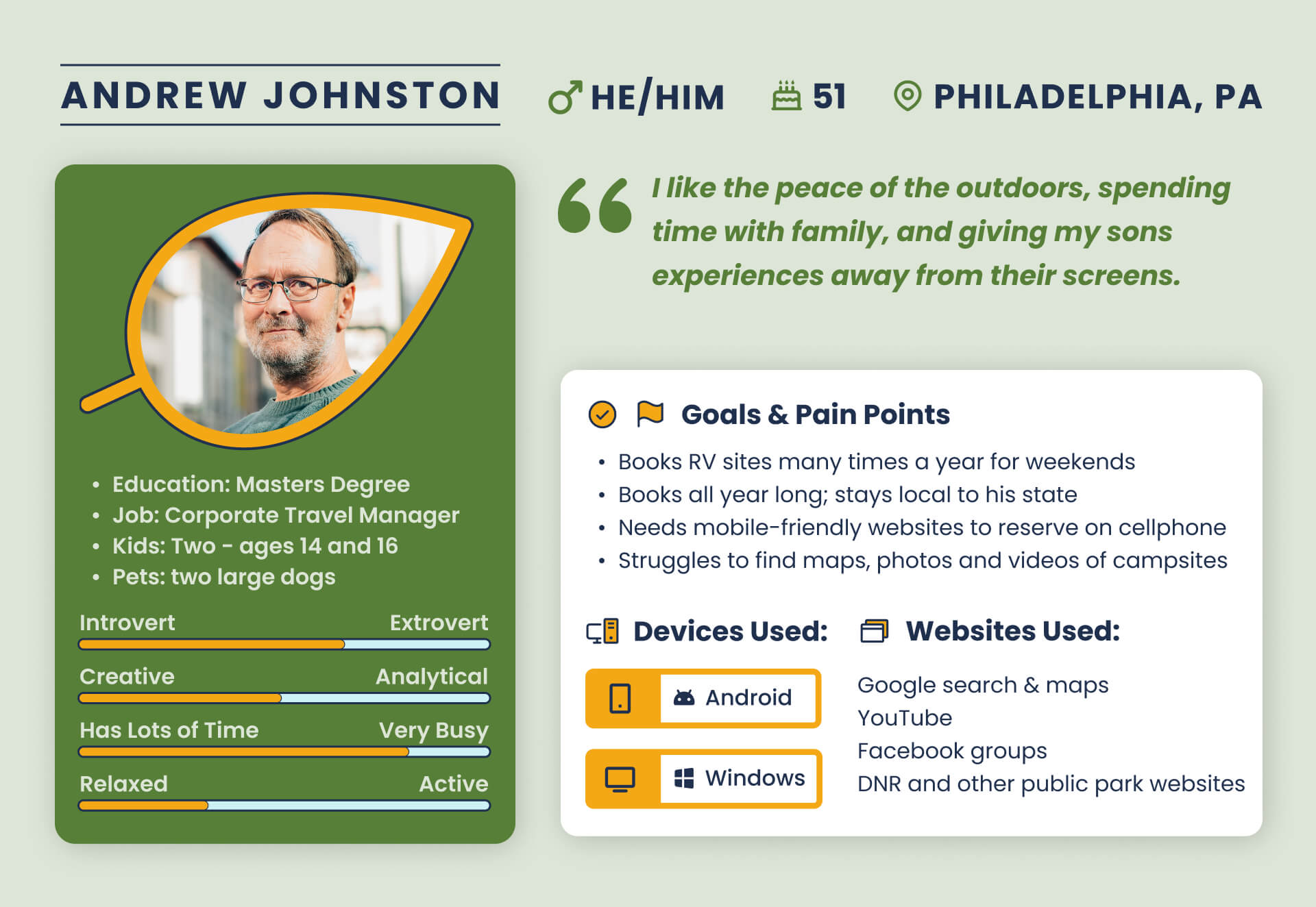
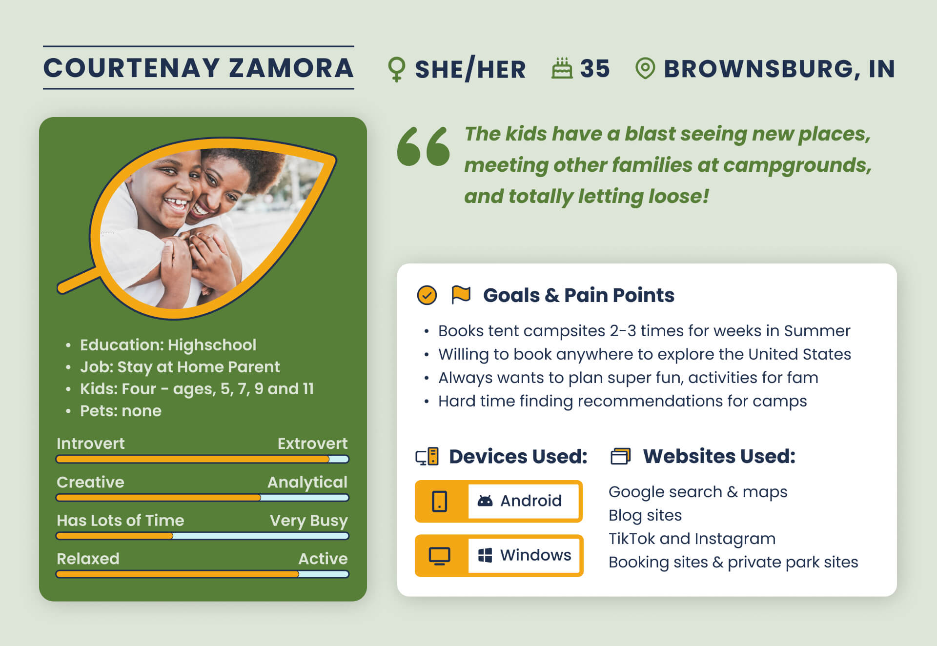
Fictional profiles were created to keep user needs in mind while planning the website.
key functions & user flow:
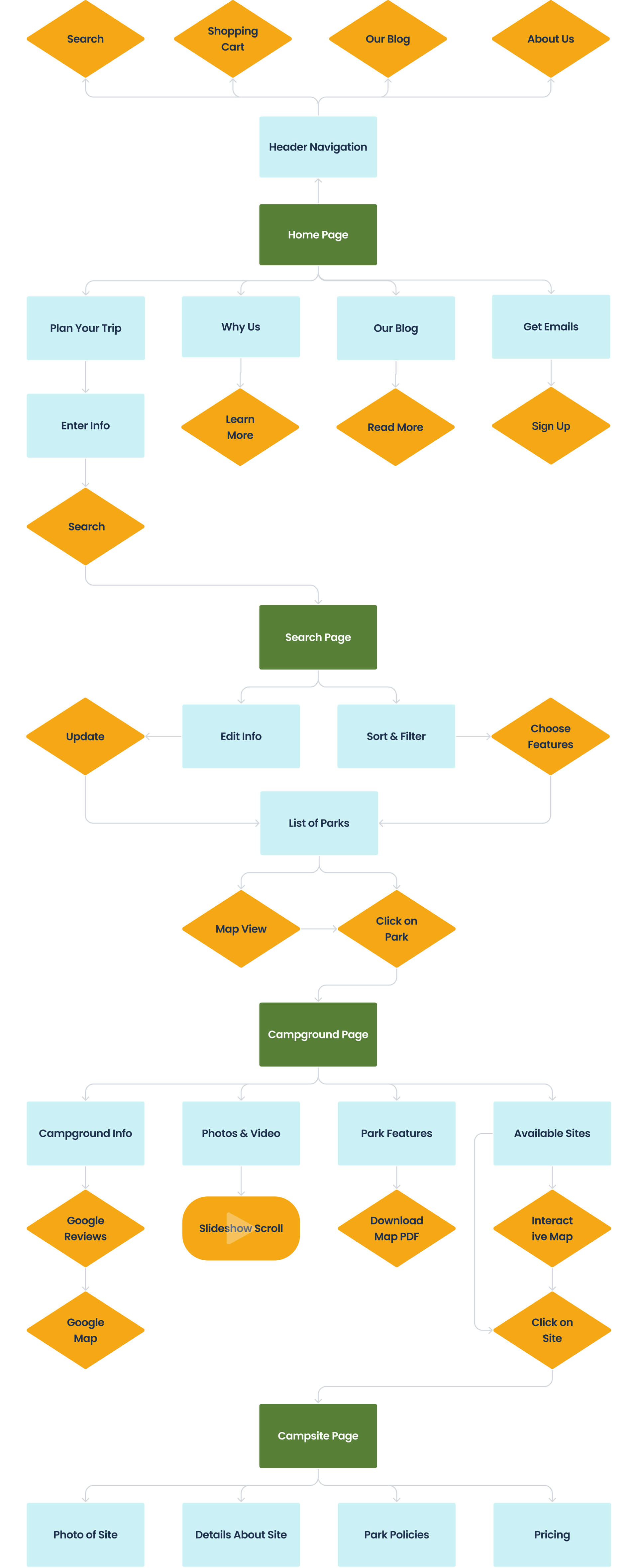
1. Be a one-stop-shop to find ALL public and private parks
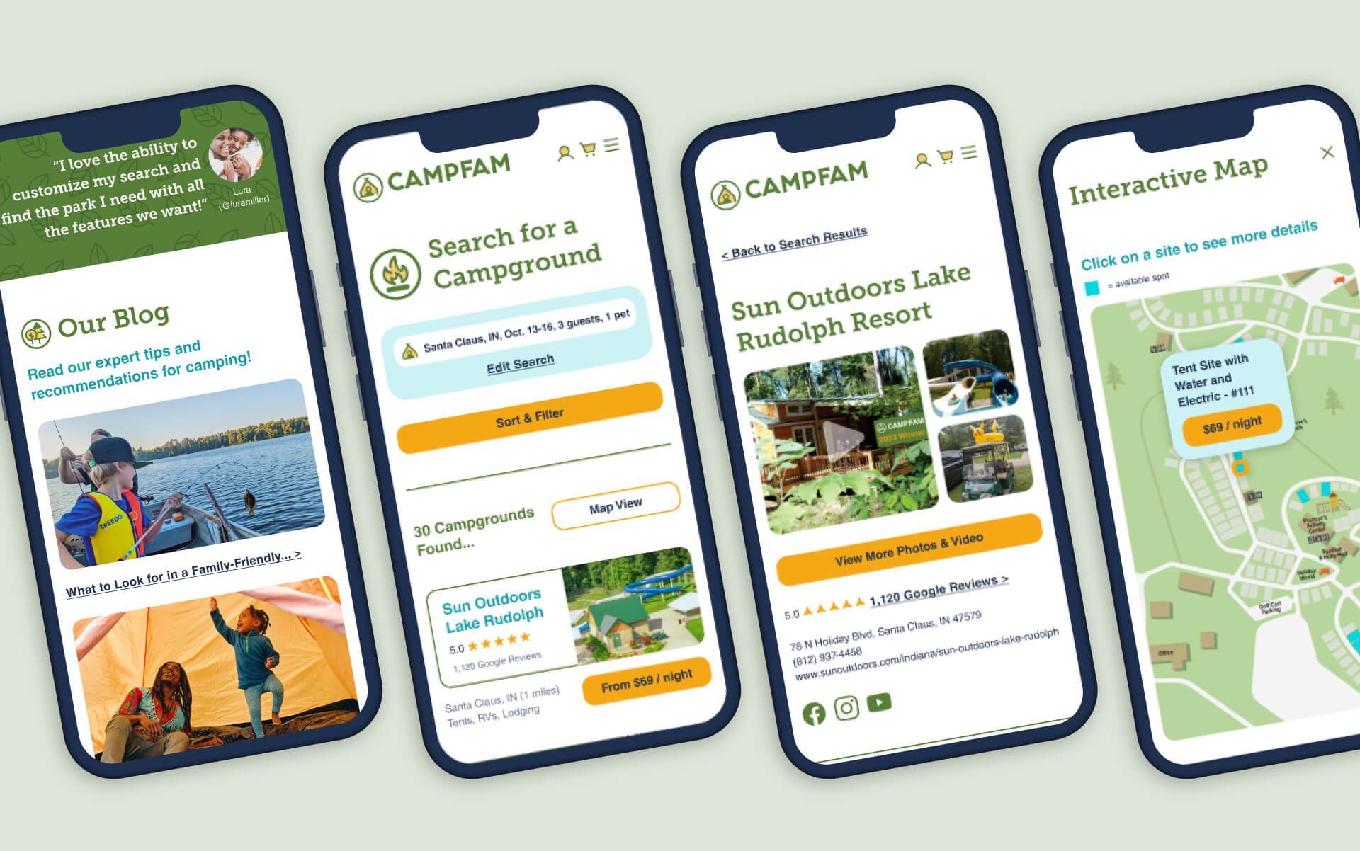
2. Sort & filter search results
3. Offer detailed info, pics, video, maps, and Google reviews on each park
4. Let you book available sites
5. Post tips for taking kids camping
mood board:
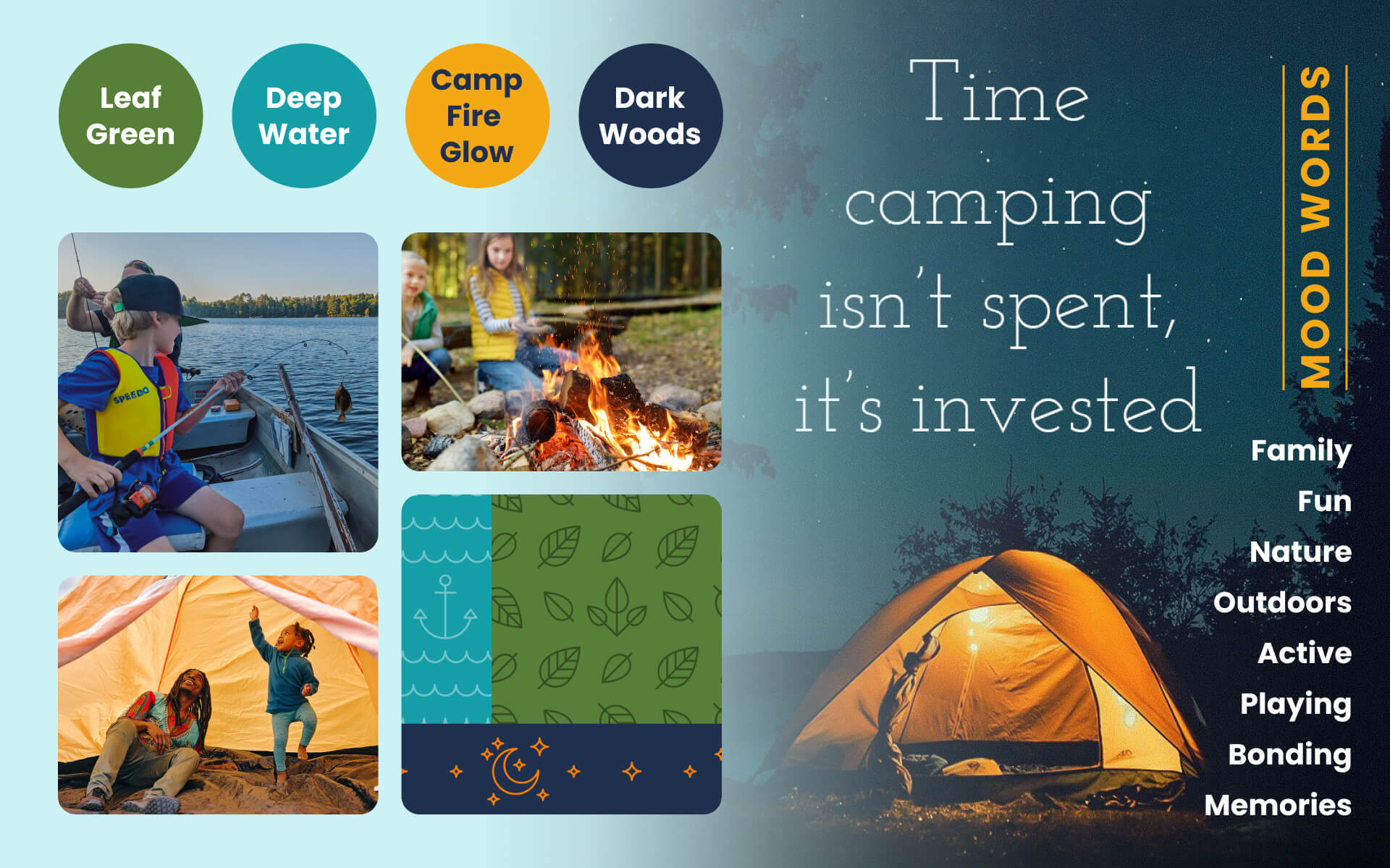
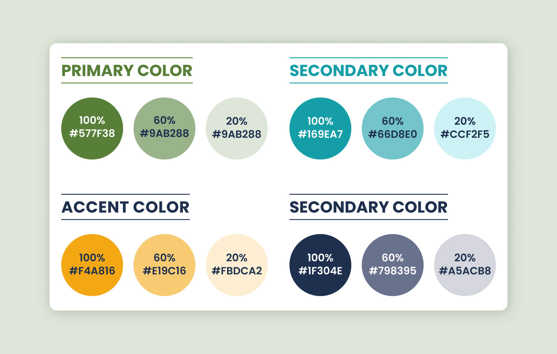
Colors chosen evoke different elements of the outdoors. The curated photography ties back into these hues and emphasizes family bonding.
typography:
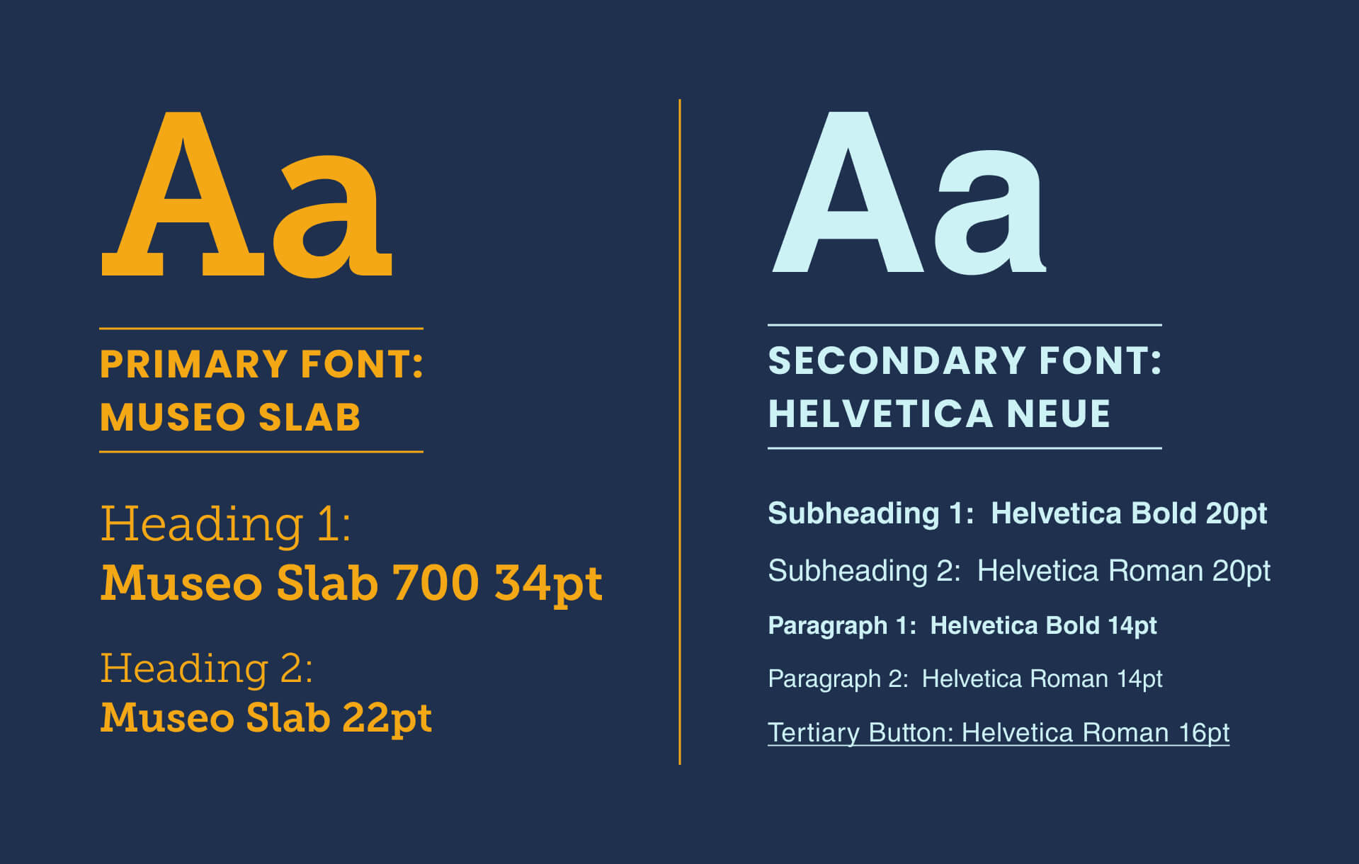
Museo Slab is a bold & clean type-writer font selected to convey a sense of nostalgia and a hint of child-like whimsy.
logo, icons & buttons:
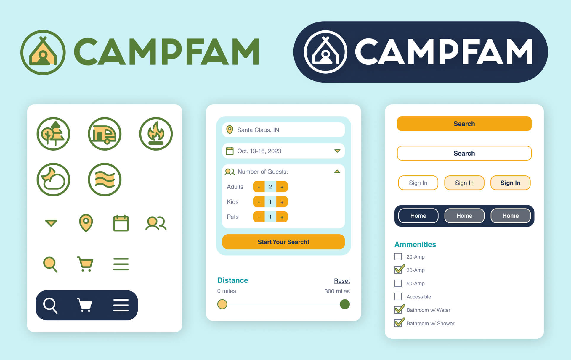
Logo and icons were developed in Illustrator, and the rest of the interface was created in Figma.
low-fidelity wireframes:
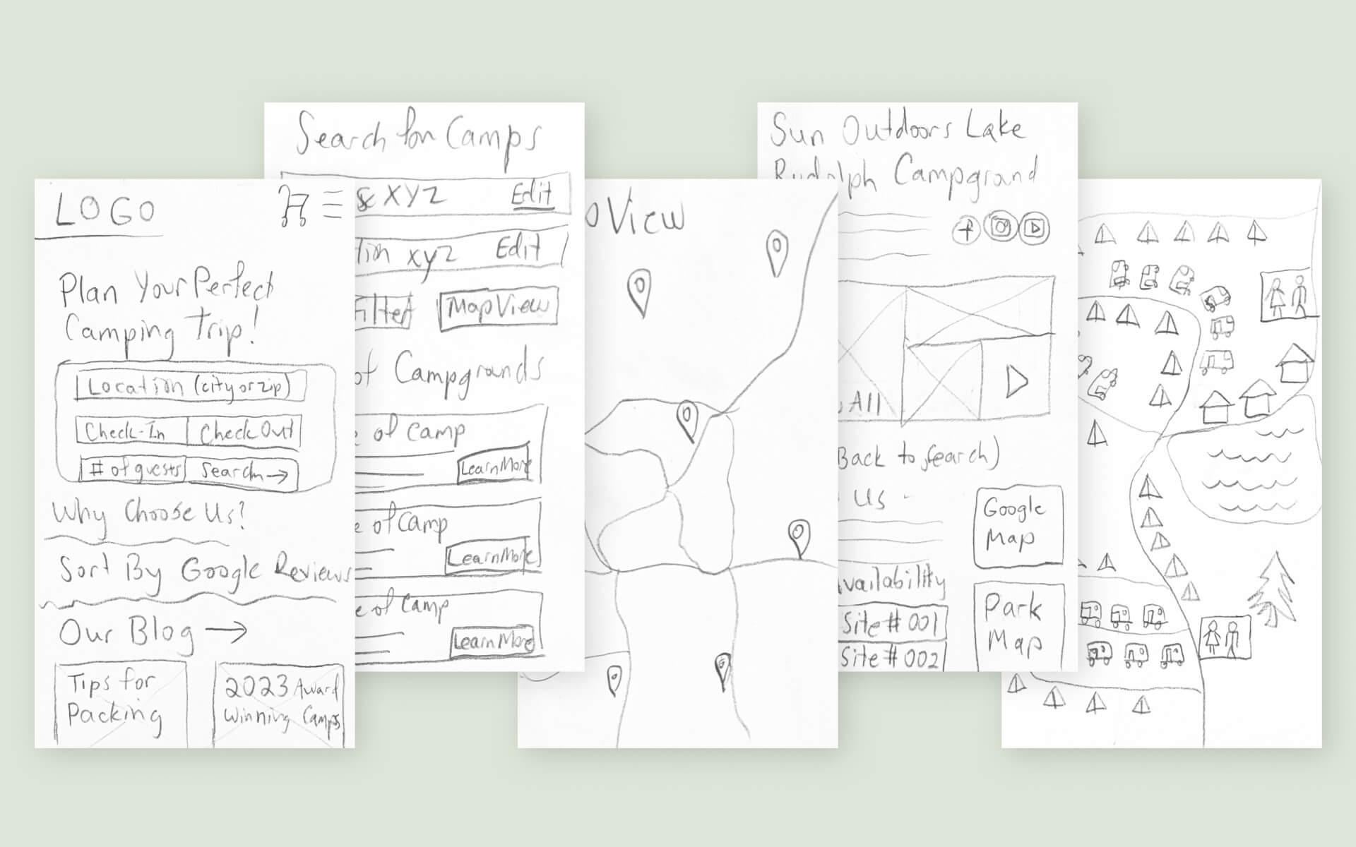
Initial wireframes were sketched with the “Crazy-8” method (8 drawings in 8 minutes) to quickly visualize the basic layout.
mid-fidelity wireframes:
Grayscale screens were developed in Figma to fine-tune the layout.
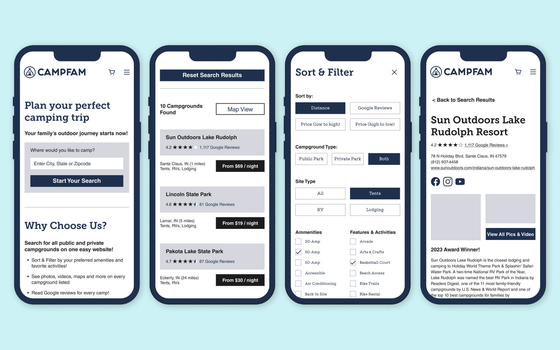
high-fidelity wireframes:
A realistic prototype was created in Figma to closely resemble the final product.
Click the button below to test out the app in action!

breakpoints:
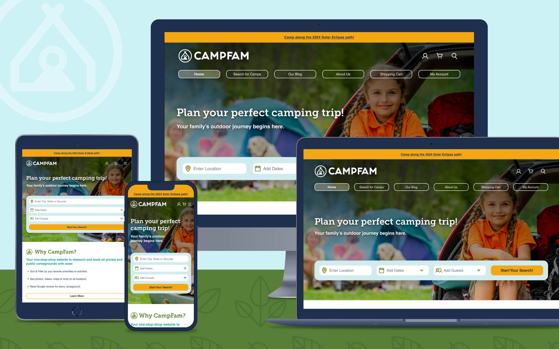
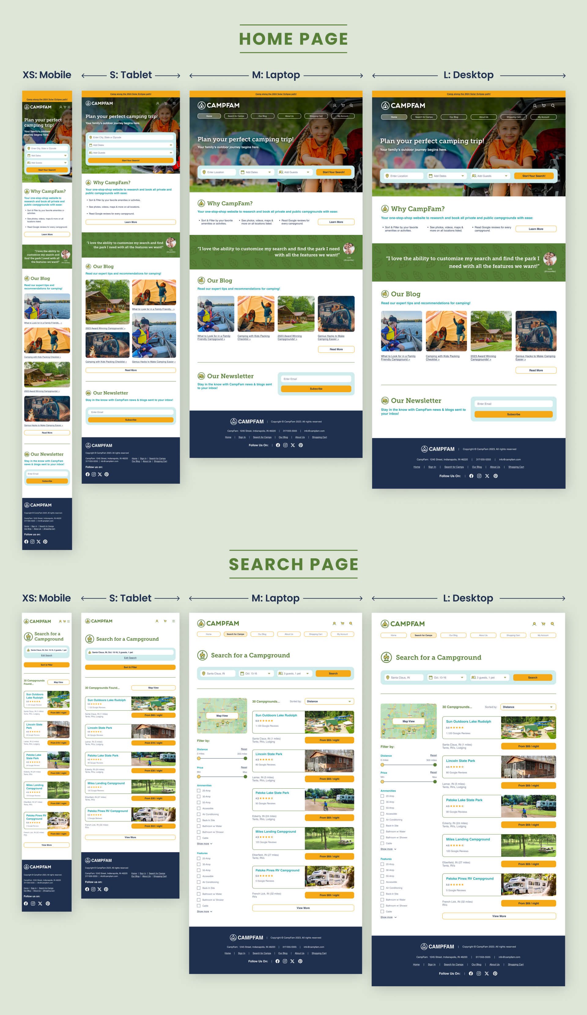
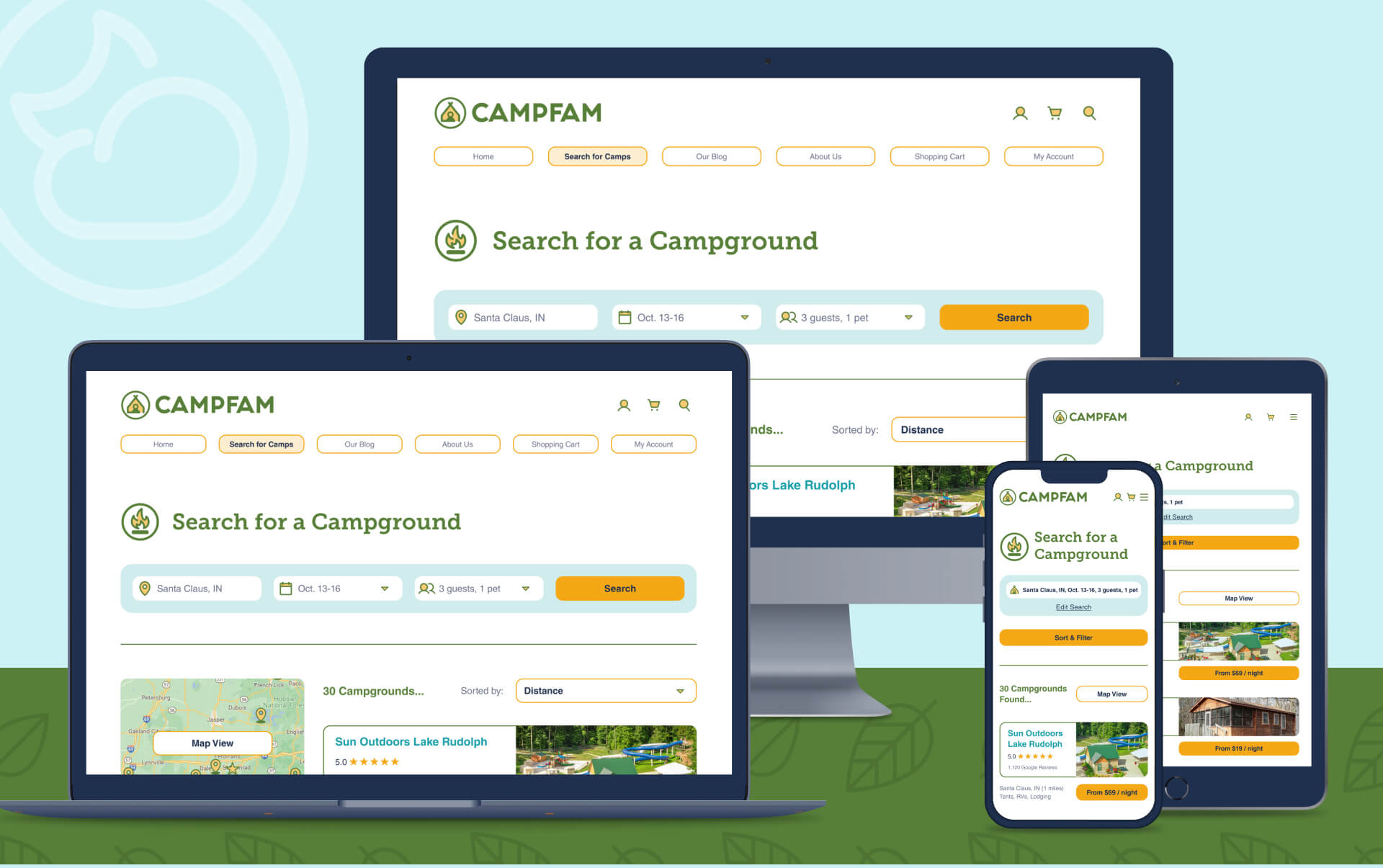
Breakpoints are the building blocks of responsive design, used to control how the layout is adapted at different device screen sizes - XS, Small, Medium or Large.
summary & project reflections:
Why did you design this piece?
The project task was to design any location-based app of your choosing. I decided on a campground reservation website because I LOVE the outdoors but it’s a struggle to find just the right campsite. So I had fun dreaming up my ideal camping app while practicing the principles of UX/UI.
What insights from your UX research had most impact on your design?
The User Interviews and User Personas were essential. One interviewee said “I just want to find my perfect campground and book it super easily.” Another said they wanted a “one-stop-shop” website. These ideals were driving mantras while developing the User Experience.
What new experience did you gain in User Interface design?
Designing with a “mobile-first” approach challenged my old school notions of first visualizing a website on a desktop computer screen. I learned how to create a fluid, adaptive grid that scaled proportionally with every increase in size.
This was also my first foray into Accessibility requirements, selecting and pairing hues with proper color contrast to accommodate visually impaired people.
What part did you enjoy the most?
On the UX side, I enjoyed researching other campground websites and planning the flow chart.
For the UI, I loved creating a mood board, curating and editing photos, and designing the logo and icons.
