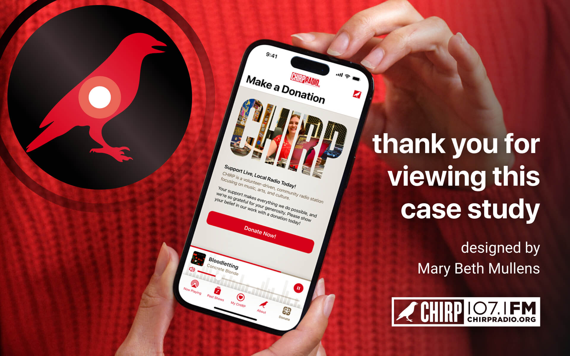
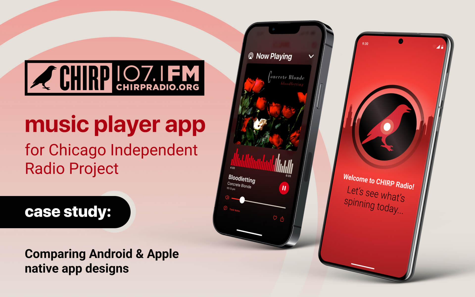
Case Study: CHIRP
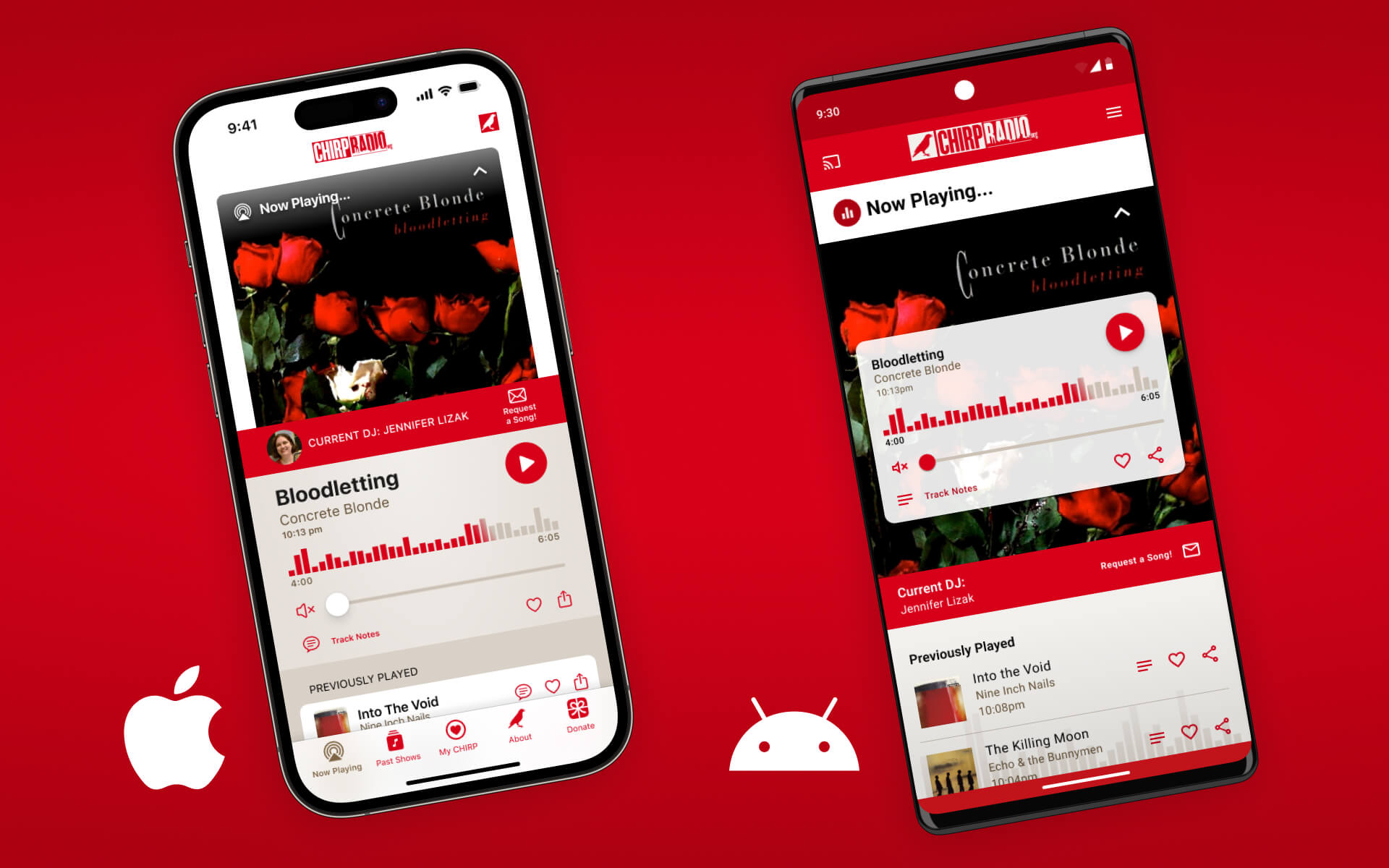
community radio player app
Overview: UX/UI Design for CHIRP Radio's music player mobile app, comparing Apple and Android requirements. Created for both a User Interface Immersion course at CareerFoundry and freelance design project for CHIRP.
Quicklinks: About | Project Brief | User Flow | Typography | Mid-Fi Wireframes | Colors | Accessibility | Logo & Icons | Feedback Animations | User Gestures | High-Fi Wireframes | Summary
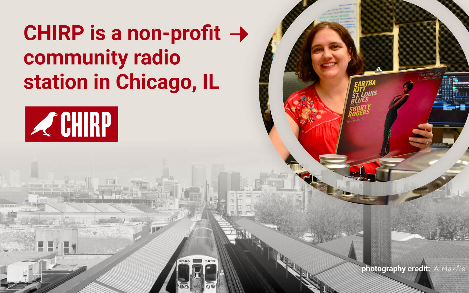
about CHIRP:
Founded in 2007 in Chicago, IL CHIRP (Chicago Independent Radio Project) is a volunteer-driven, listener supported community radio station. They can be heard everyday on 107.1 FM in the city or worldwide online.
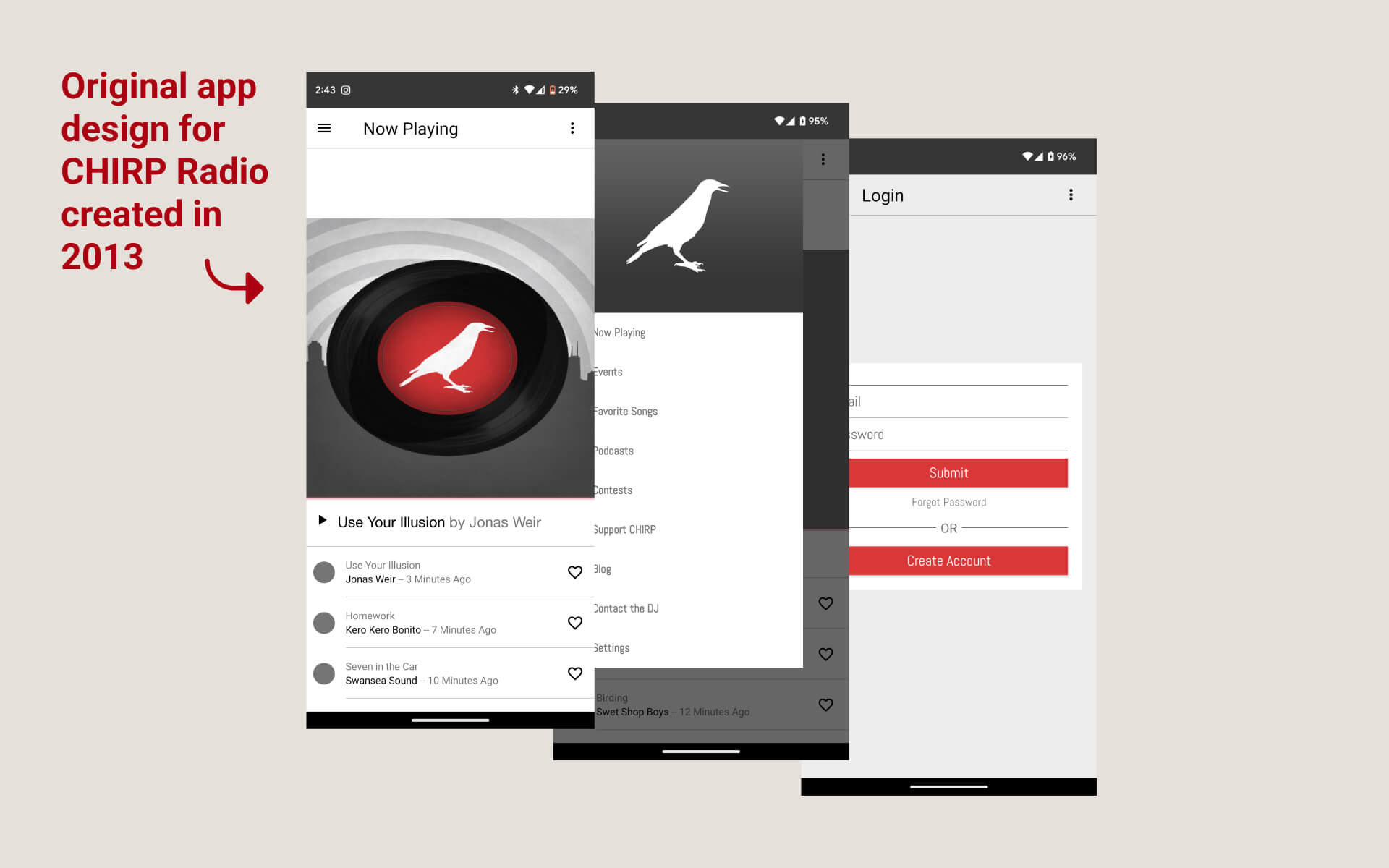
refreshing their app:
Originally developed over ten years ago in 2013, CHIRP's current mobile app design is due for a refresh and update to Android and Apple's most recent operating system standards.
Did you know? A native app is an one specifically built for & downloaded to your device. When creating an app for Apple or Android phones, it’s best to stick as closely as possible to each device's different design guides to ensure users on either platform understand the app.
project brief:
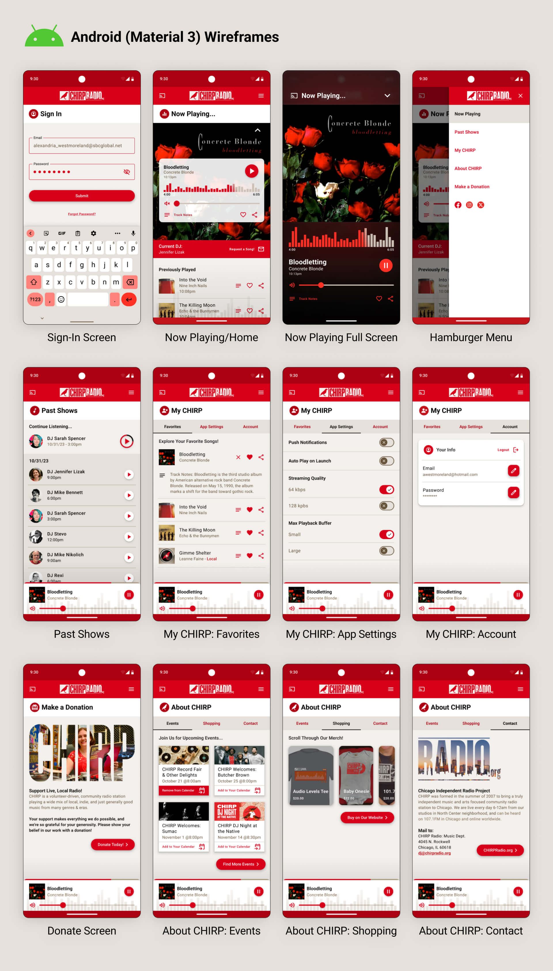
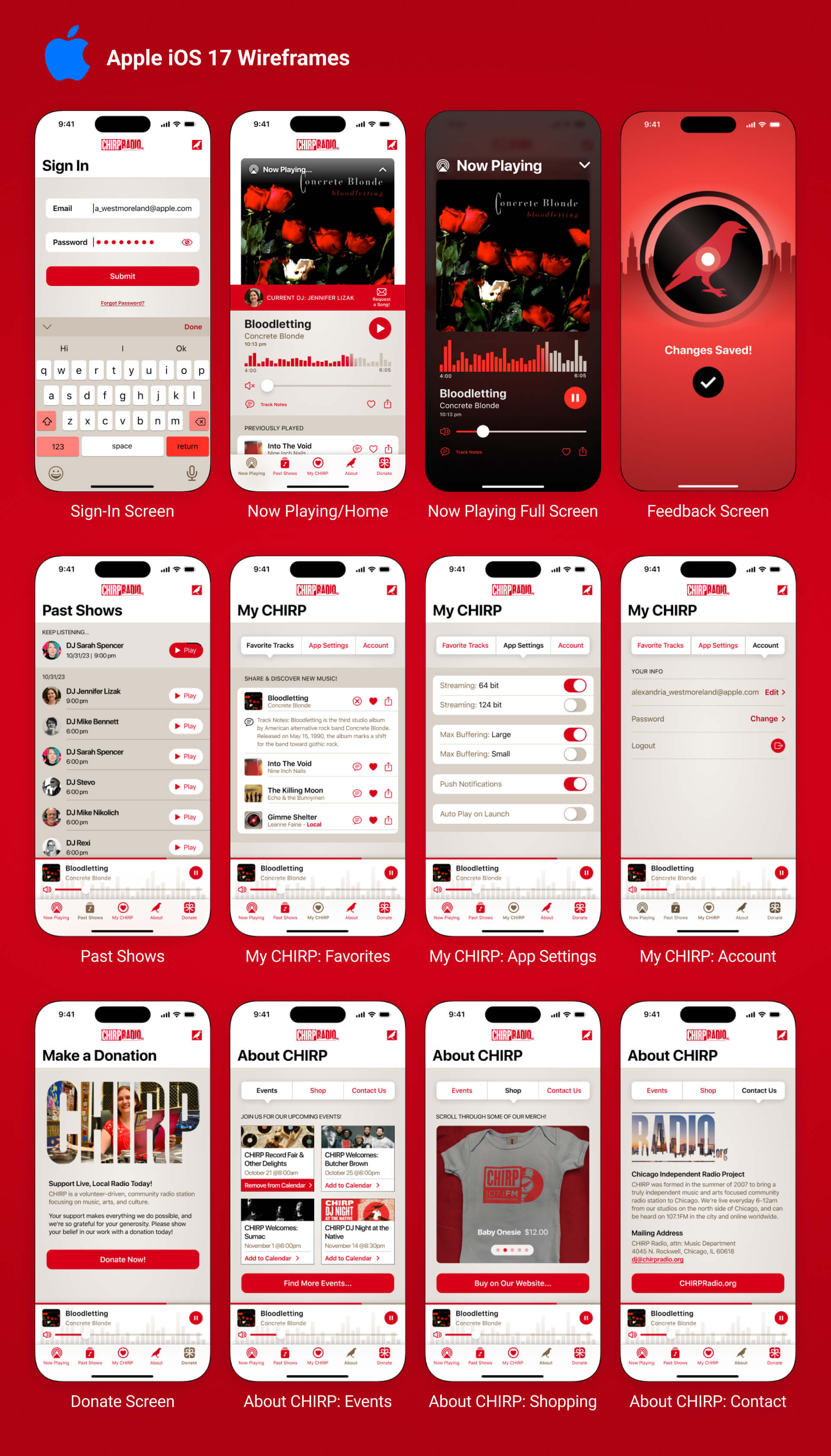
Design two versions of a CHIRP native mobile app: one for the Android's 'Material 3' operating system and one for Apple's iOS 17' operating system.
1. Native mobile design patterns using each platform’s guidelines
2. Clearly defined typography & color
3. Consistent, intuitive UI design
4. User gestures demonstrated
5. Appropriate use of UI feedback
6. Designed for accessibility
key functions & user flow:
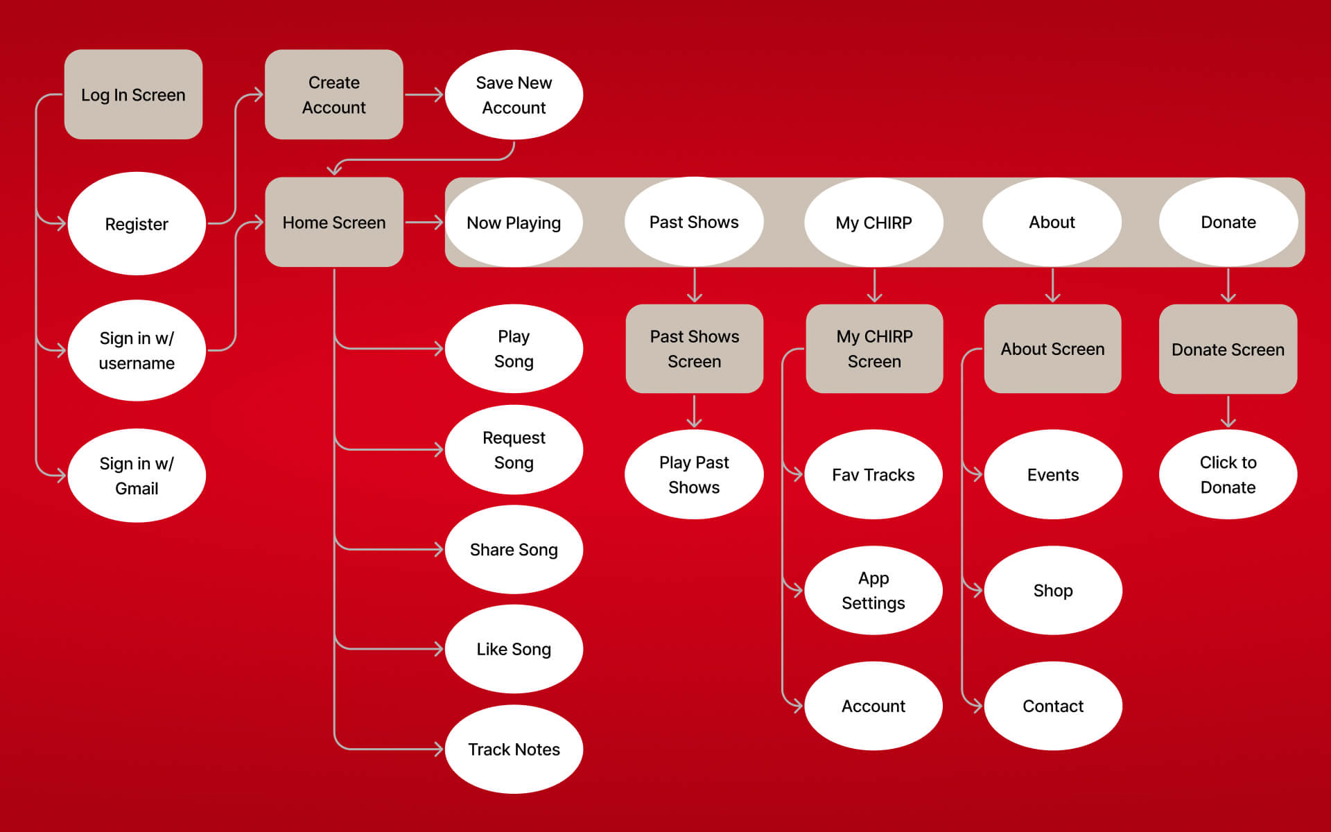
The primary use of the app is to play what's streaming live on CHIRP
Radio.
Based on research of existing public radio stations KEXP Seattle and KCRW Los Angeles, other key functions were
identified (but still kept to a minimum):
1. Sign In or Create Account
2. Listen to What’s Playing Now
3. Request a Song
4. Save or Share Fav Songs
5. Read DJ Track Notes
6. Listen to Past Shows
7. Adjust Account/App Settings
8. View Events & Shop Merch
9. Donate to CHIRP
typography:
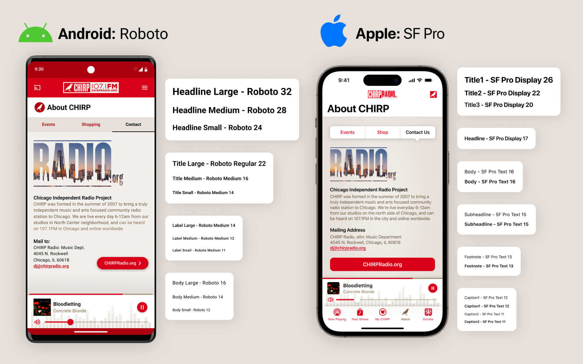
Android and Apple each have their own recommended typefaces that users of their apps are accustomed to.
mid-fidelity wireframes:
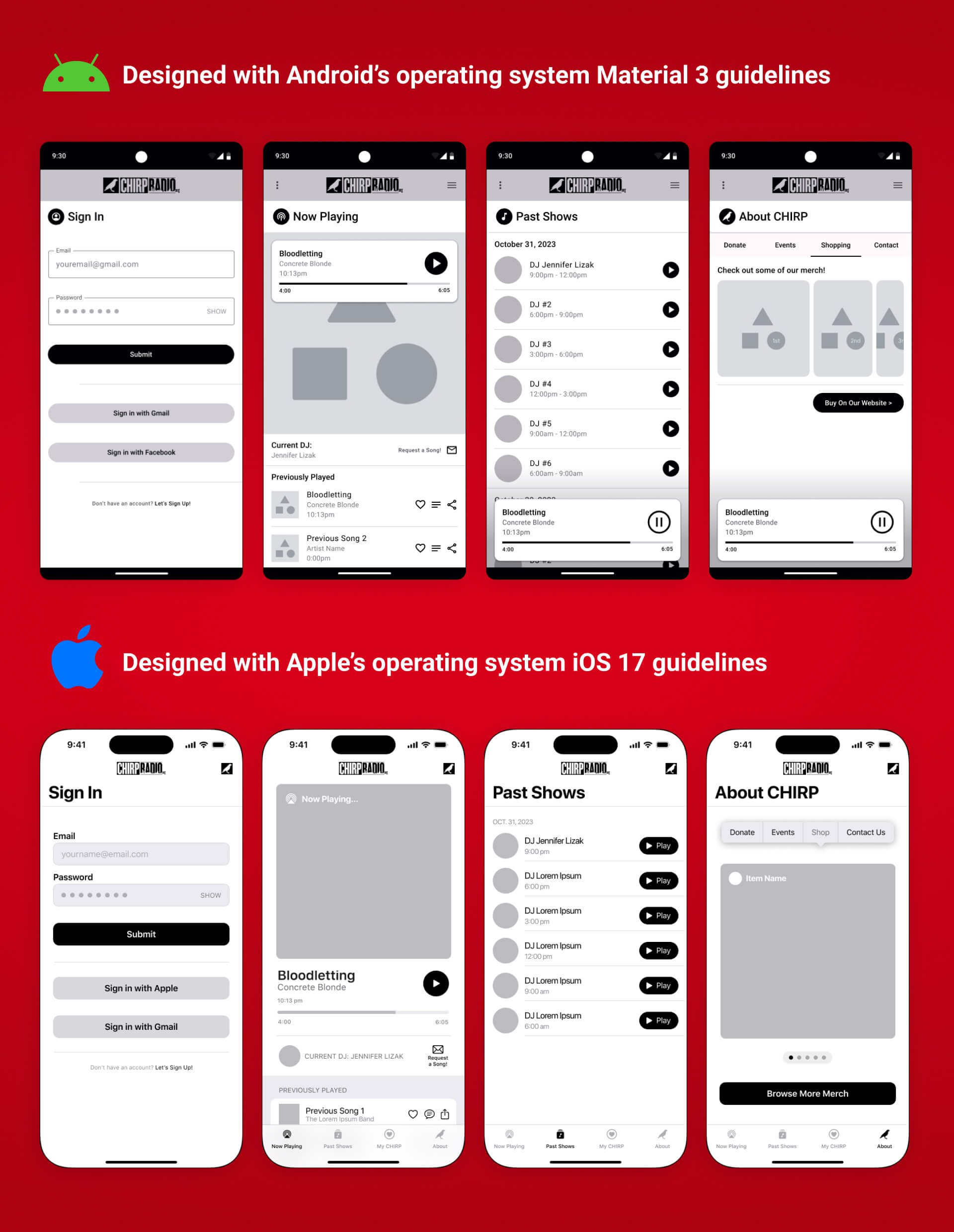
Grayscale screens were developed in Figma to establish the app's layout.
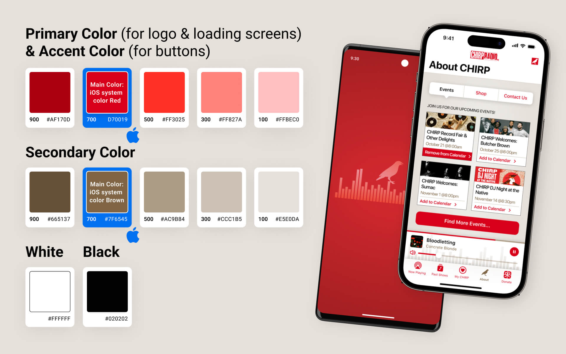
colors:
The same hues were used for both designs, starting with Apple's iOS recommended color palette then branching off into shades and tints of each color.
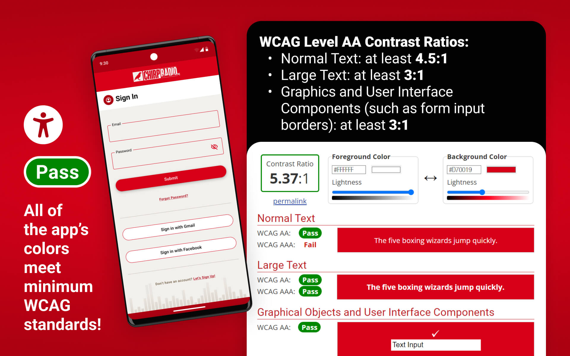
color contrast accessibility:
WCAG (Web Content Accessibility Guidelines) requires a
minimum ratio of color contrast between fonts or icons and their background to accomodate people with visual disabilities.
All colors in this app meet WCAG Level AA standards!
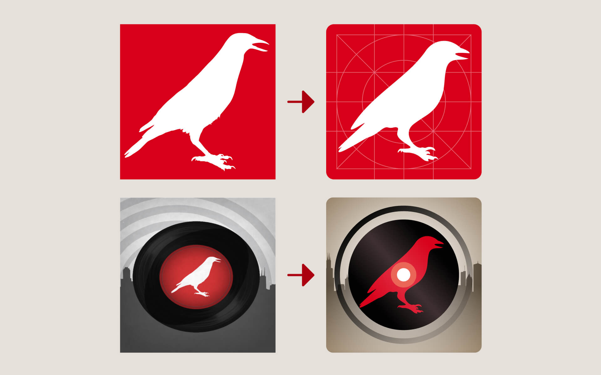
logo refresh:
The CHIRP bird logo was cleaned up and simplified for an app icon using Adobe Illustrator.
Their old album placeholder image was updated in Figma.
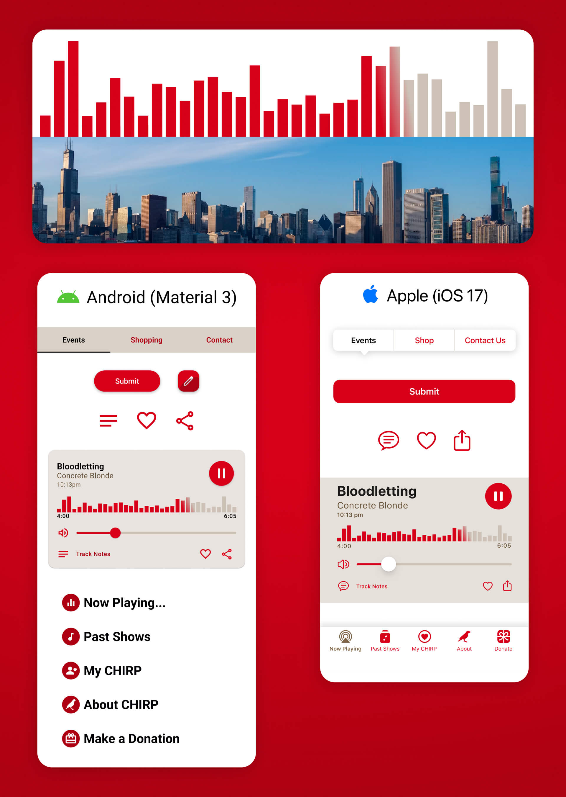
icon design:
Volume levels were designed in the silhouette of the Chicago skyline.
Icons and interfaces were designed in accordance with each platform’s guidelines.
user interface feedback:
Visual feedback was demonstrated with animations & interactive elements that were constructed with Figma's prototype function.
Example #1: When first opening the app, an animation plays to let the user know the app is processing and loading up.
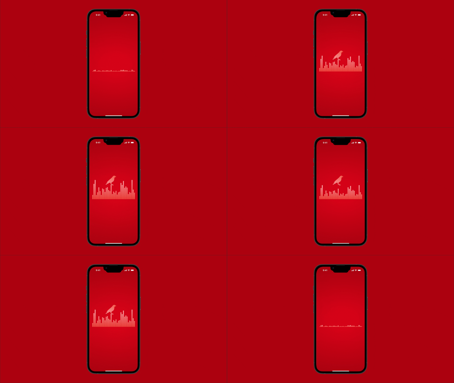
Example #2: Once you press play, the song title scrolls and the sound levels move to indicate music is playing.
Example #3: An animated Feedback Screen appears when the user makes changes to the app's settings.
user gestures:
App gestures used are consistent with current mobile design patterns.
Example #1: User swipe left on both apps to scroll through photos and merchandise.
Example #2: Users tap once for buttons on both apps.
high-fidelity wireframes:
High-quality designs of each screen were created in Figma, including a functioning prototype that closely resembles the final app on each platform.
summary:
The final assets and wireframes will be presented to CHIRP Radio's board members as a proposal for redesigning their app. Implentation would be handed off to CHIRP's web developer.
