Case Study: Marigold Clothing
women's boutique branding
Overview: Brand Guideline Booklet Design highlighting my work as Marketing Manager for Marigold Clothing, a successful upscale Indianapolis boutique open since 1989.
Quicklinks: Cover | Brand Identity | Guiding Principles | Logo | Icon | Colors | Typography | Marketing | Photography | Website | Summary
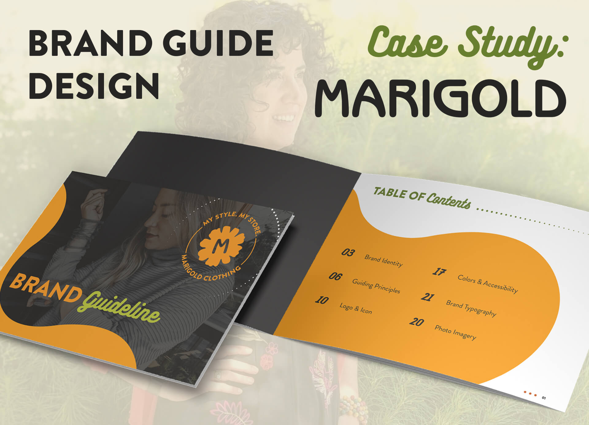
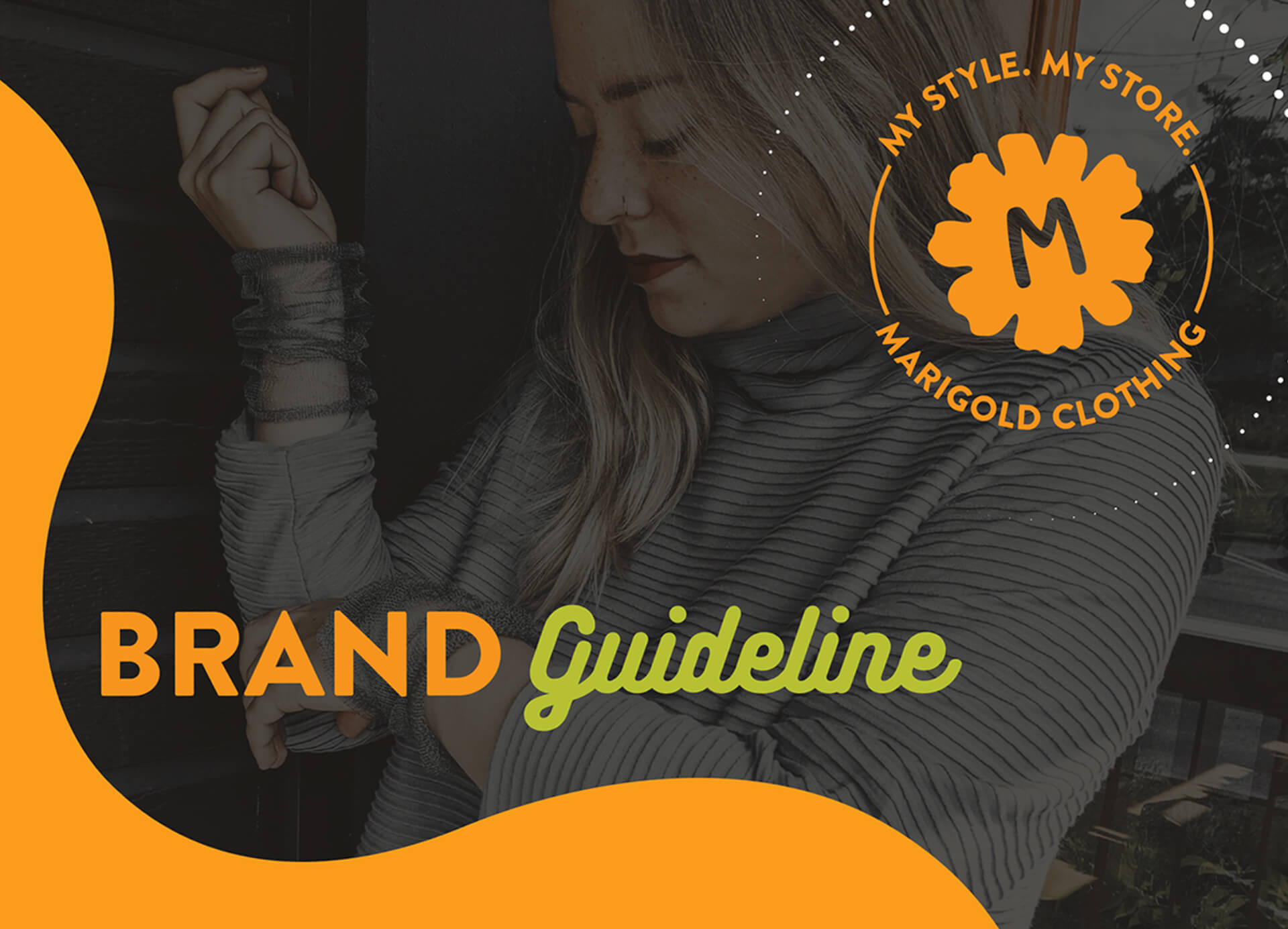
brand guide cover:
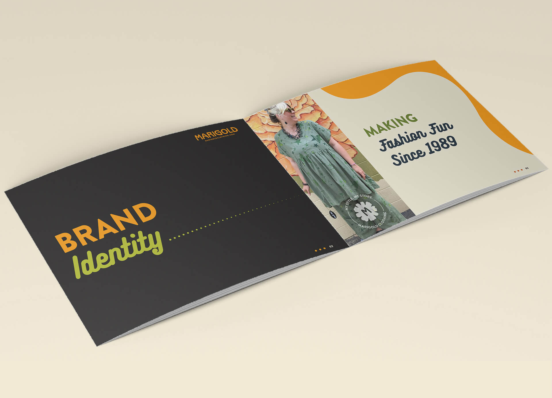
brand identity:
Relevant quotes plus photos of staff and customers throughout the brand guide emphasize Marigold's core identity of making a genuine connection with their audience.
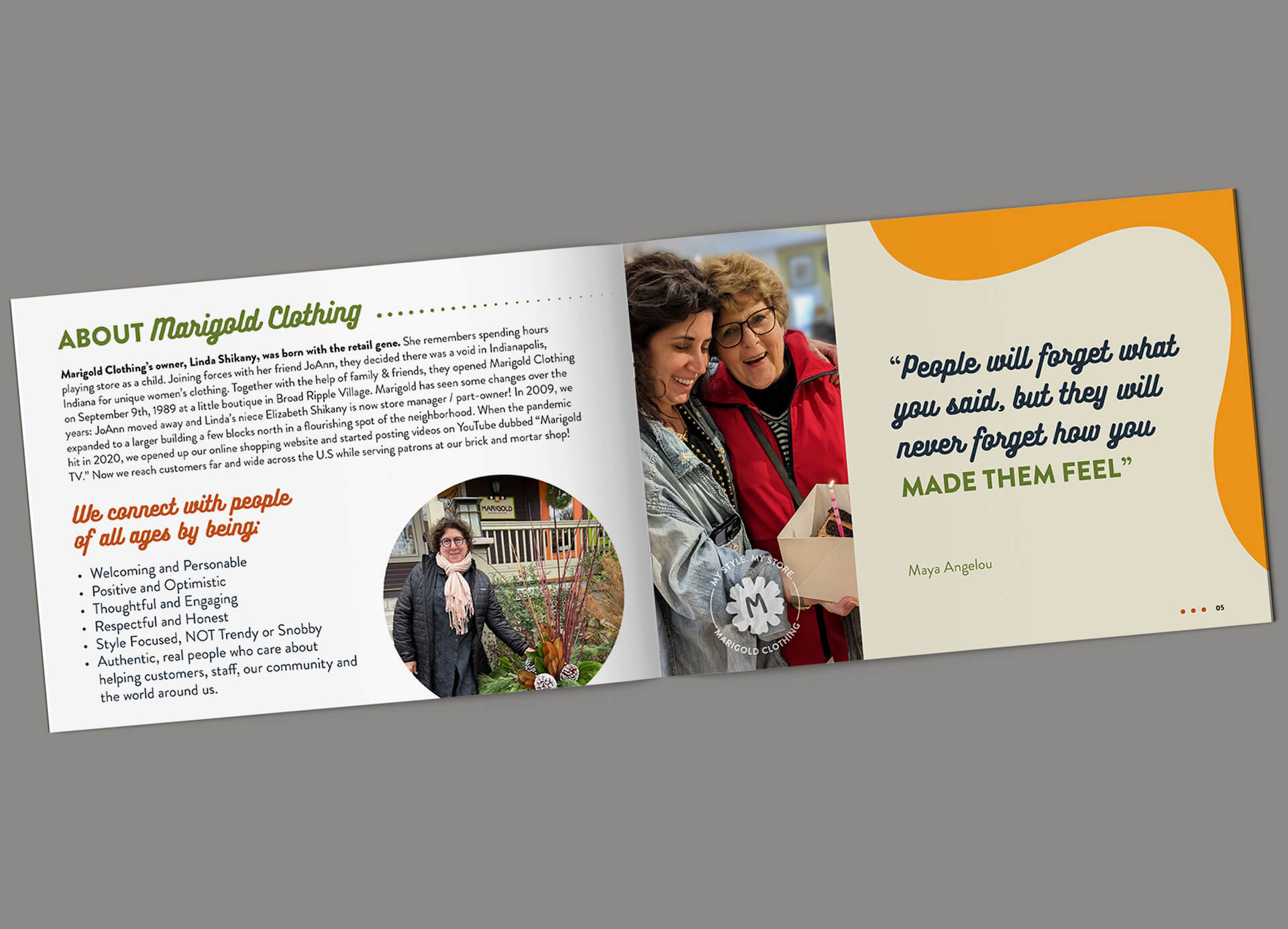

guiding principles:
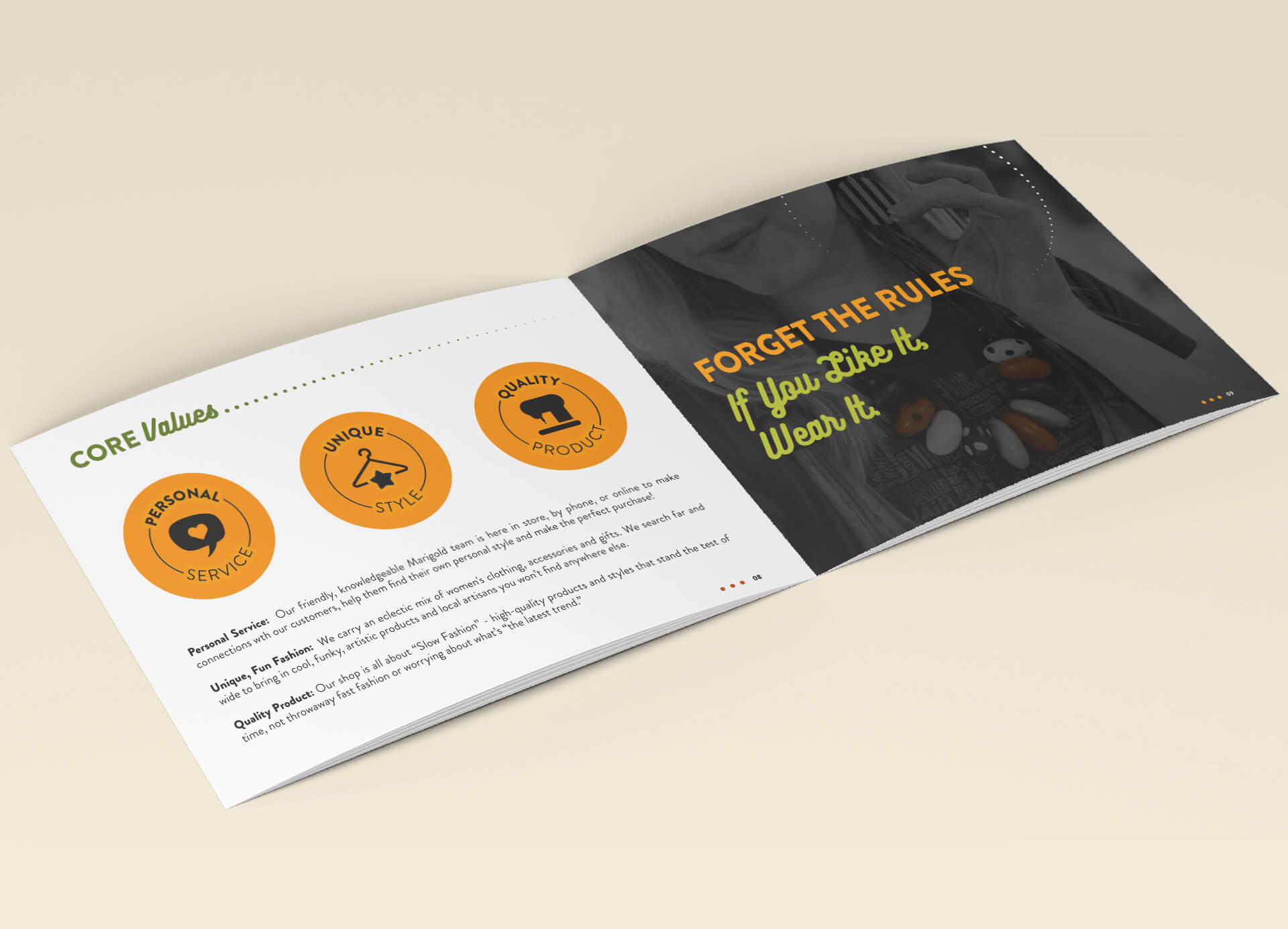
Along with connecting to their customers, Marigold Clothing can best be summed up with 3 core principles: providing Personal Service, Unique Style and Quality Product.
logo:
icon:
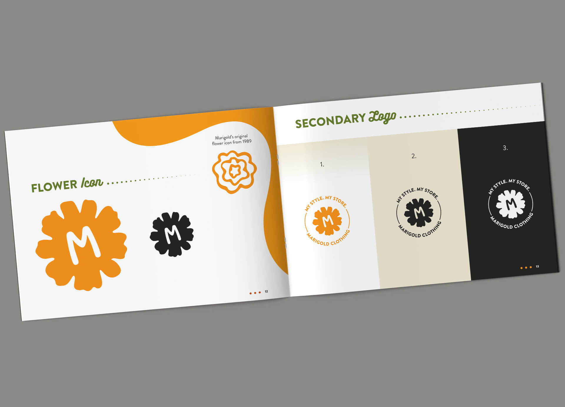
A new bold flower graphic replaced the original "folksy" flower drawing.
colors & accessibility:
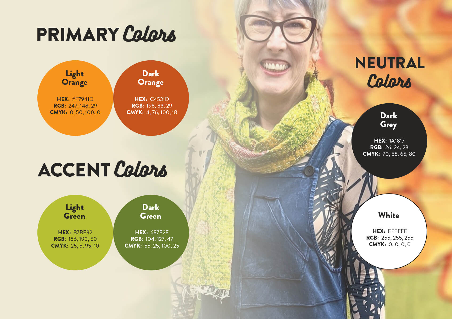
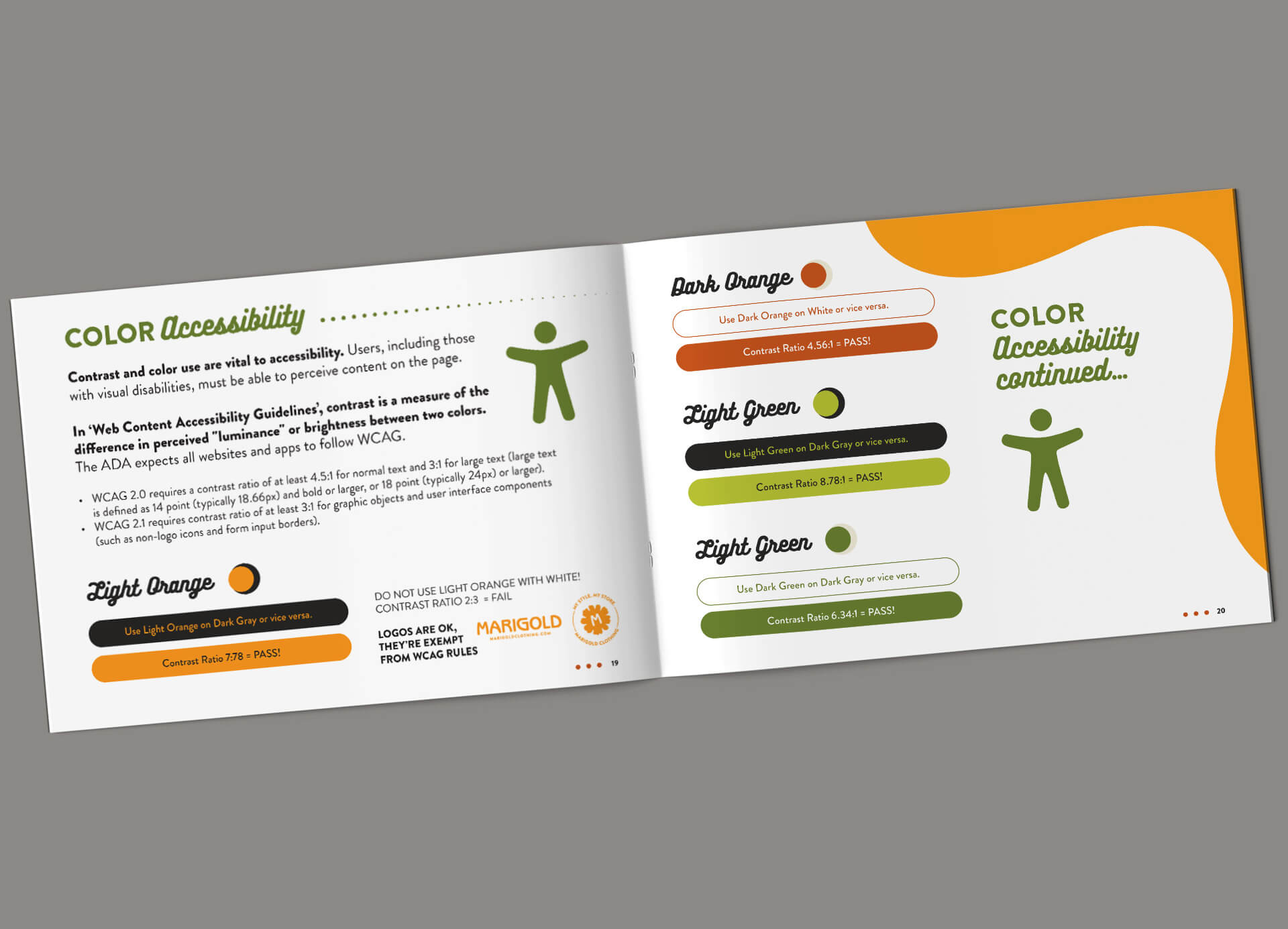
Marigold's core brand colors remain orange and lime green, but darker shades were needed to meet WCAG Level AA Standards on light backgrounds.
WCAG (Web Content Accessibility Guidelines) requires a minimum ratio of color contrast between fonts or icons and their background to accommodate people with visual disabilities.

typography:
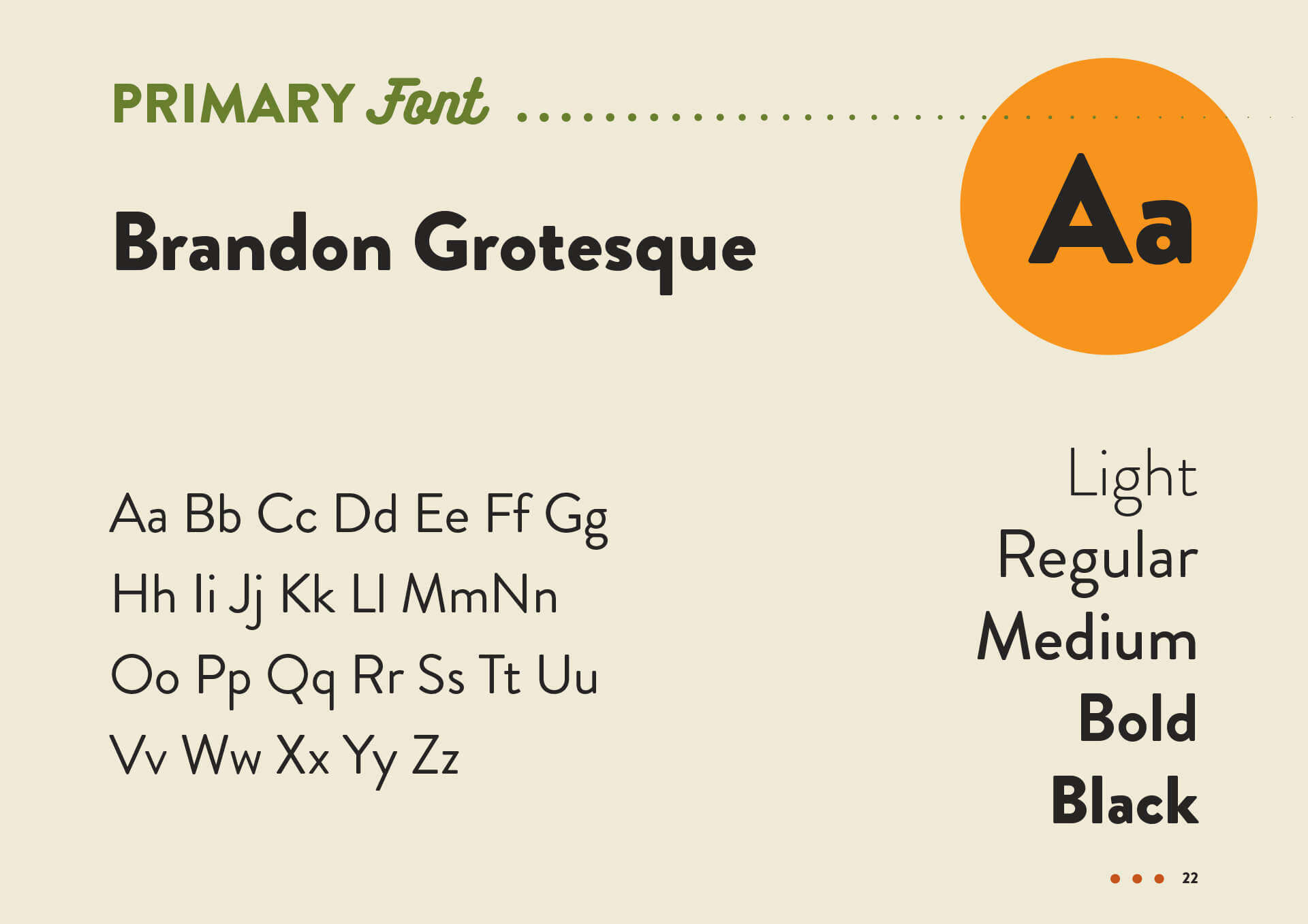
Brandon Grotesque's sans-serif typeface was chosen for it's contemporary yet enduring appearance.
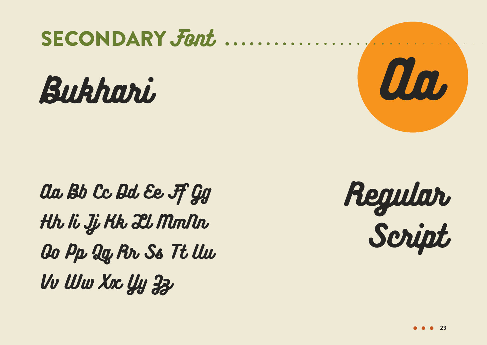
Buhkari's easy-to-read handwriting font adds extra flair to adverstisements or social media.
imagery & marketing:
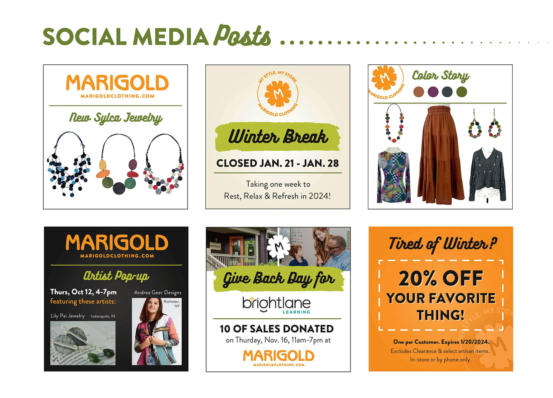
Marketing collateral and social media aim for a personal and artistic approach.
photography:
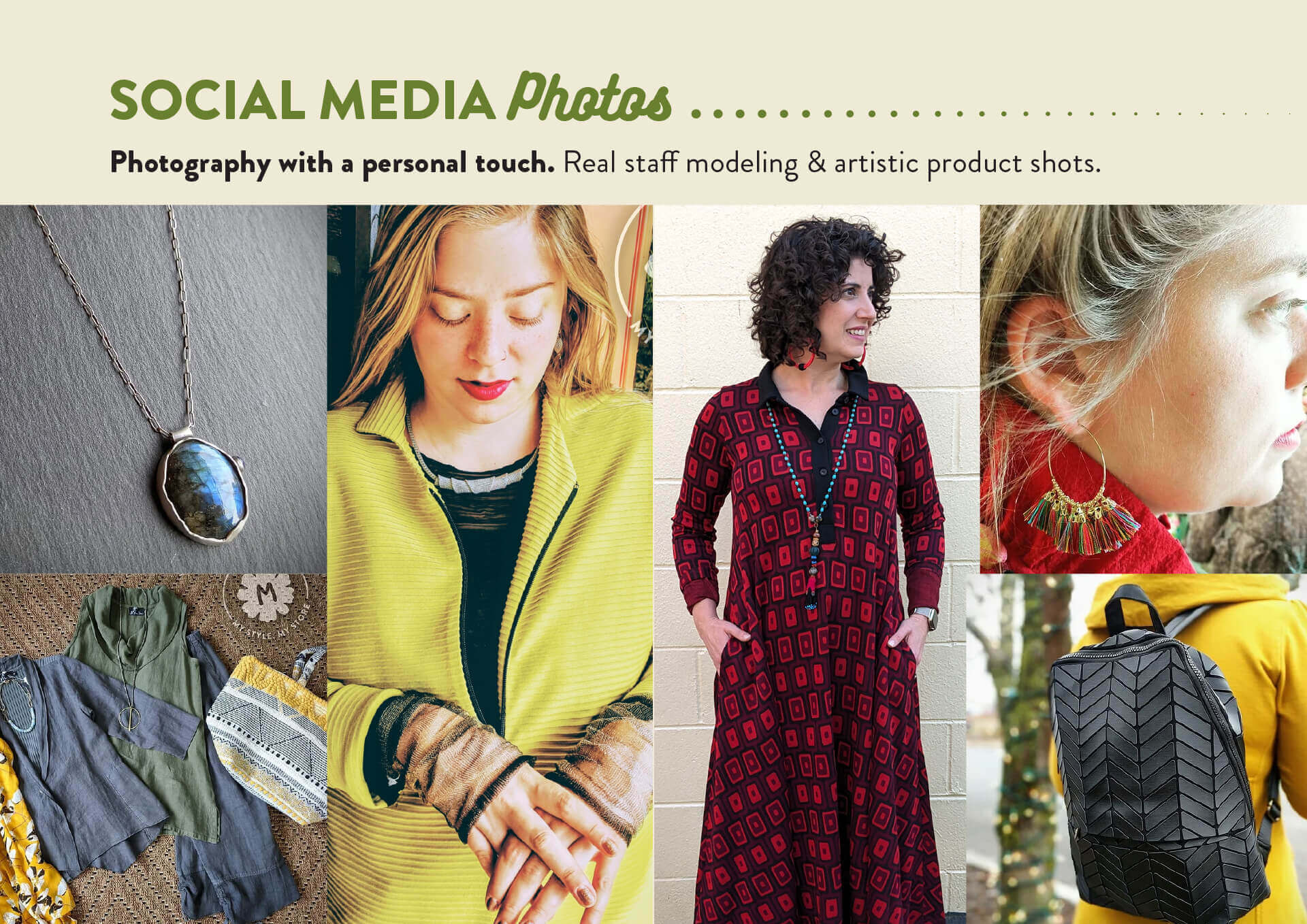
All photography was shot by Mary Beth Mullens with a Google Pixel 6a camera and either professional or natural lighting.
website:
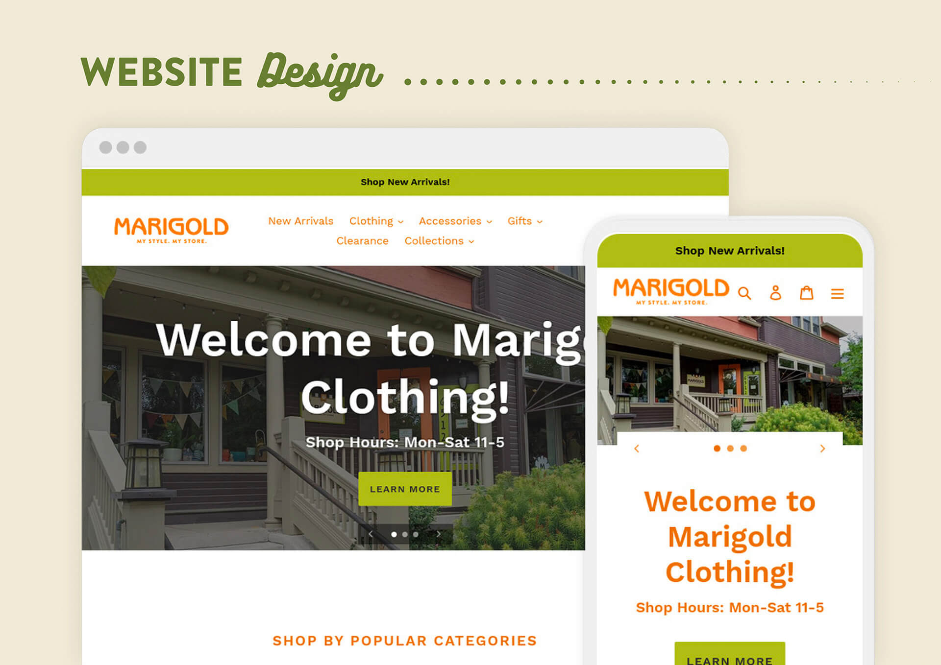
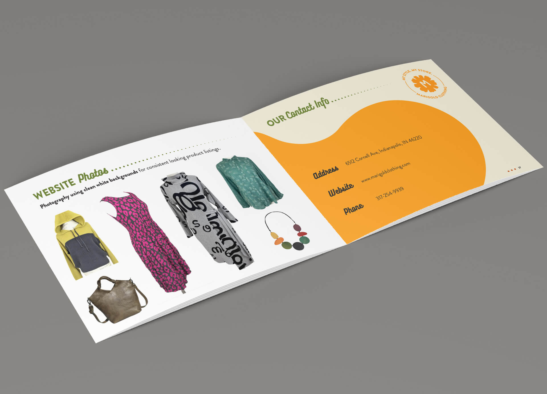
Since Marigold features a lot of funky fashion, a balance was achieved on the website design with a simple, clean interface and consistent product photography on white backgrounds.
summary:
Marigold Clothing is going strong into it's 35th year of business in Indianapolis, connecting with their customers and community, reaching new audiences online, and making fashion more fun than ever!