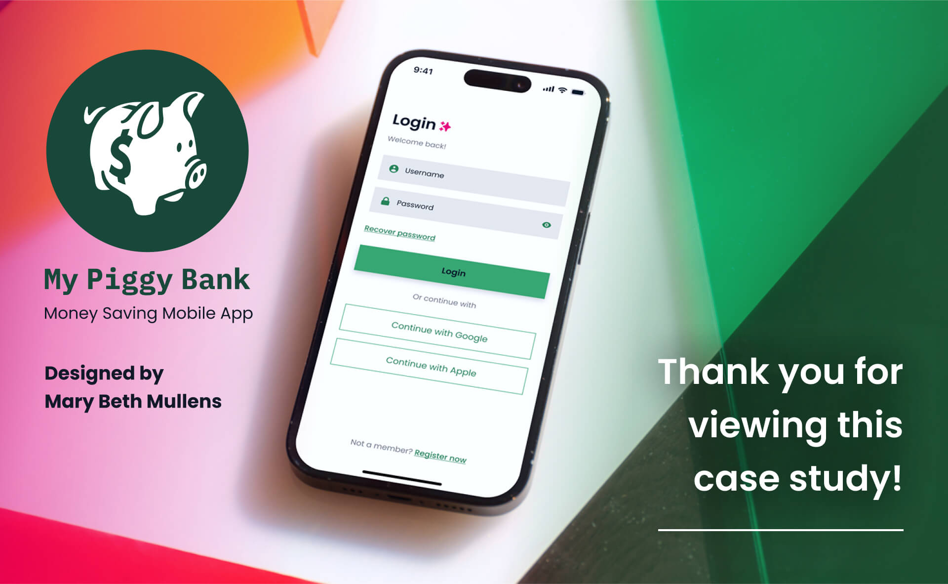
Case Study: My Piggy Bank
money saving website
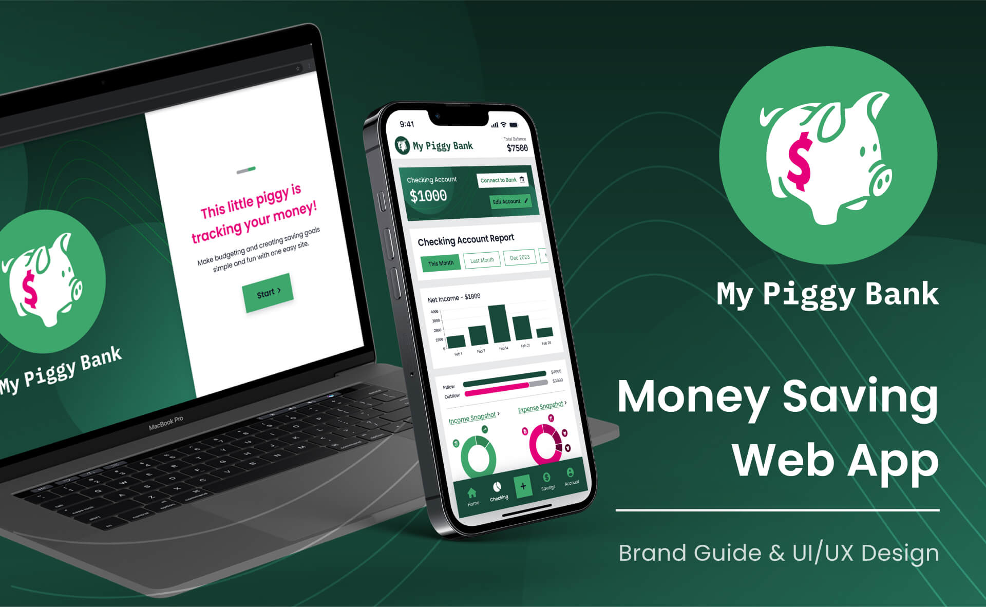
Overview: Brand Guide and UX/UI Design for a potential budgeting website. Created for User Interface Immersion course at CareerFoundry.
Quicklinks: Introduction | Logo | Colors | Accessibility | Typography | Imagery | User Experience | User Interface | Breakpoints
project brief:
Design a relatable, accessible financial web app that makes saving easy & fun!
responsive design:
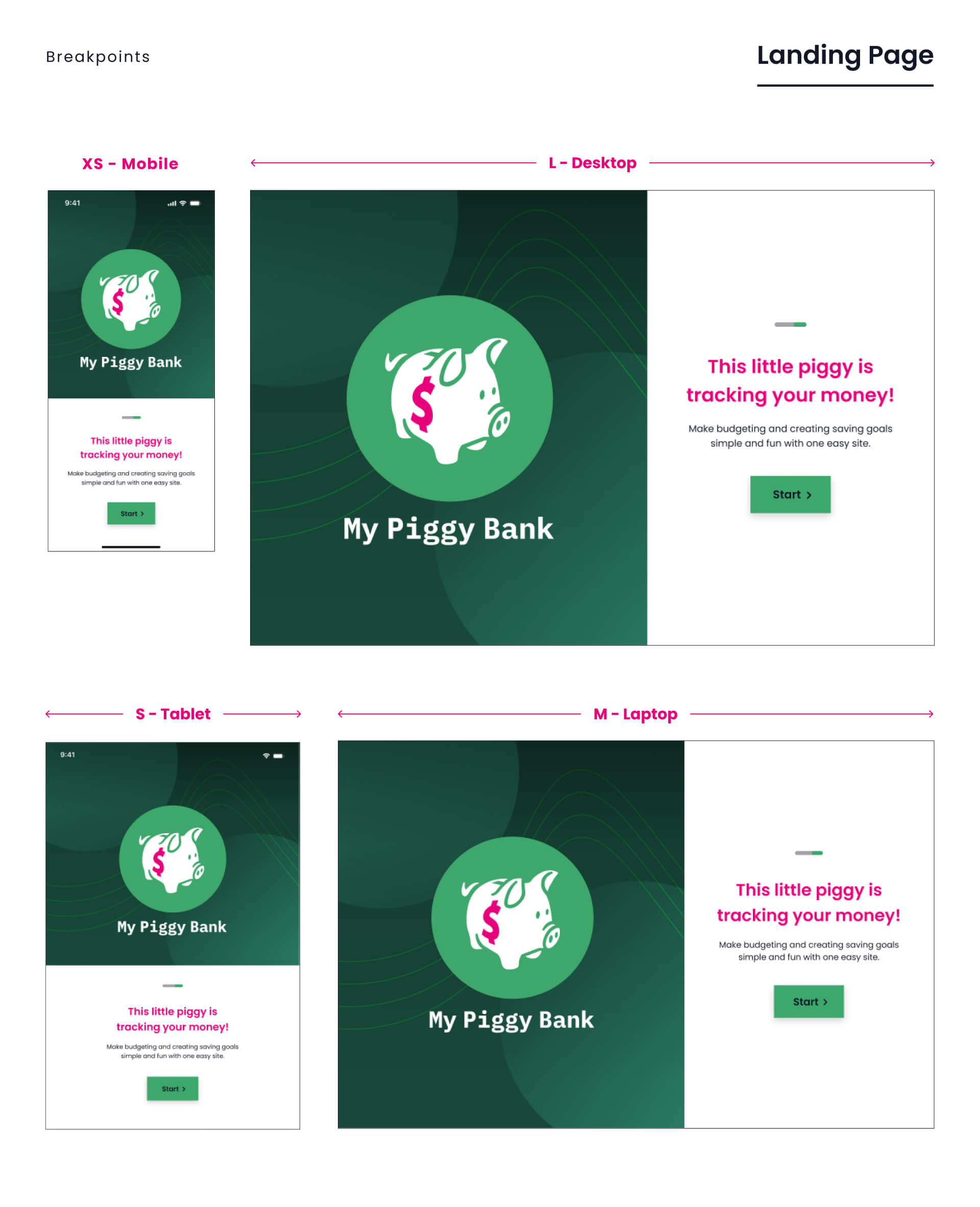
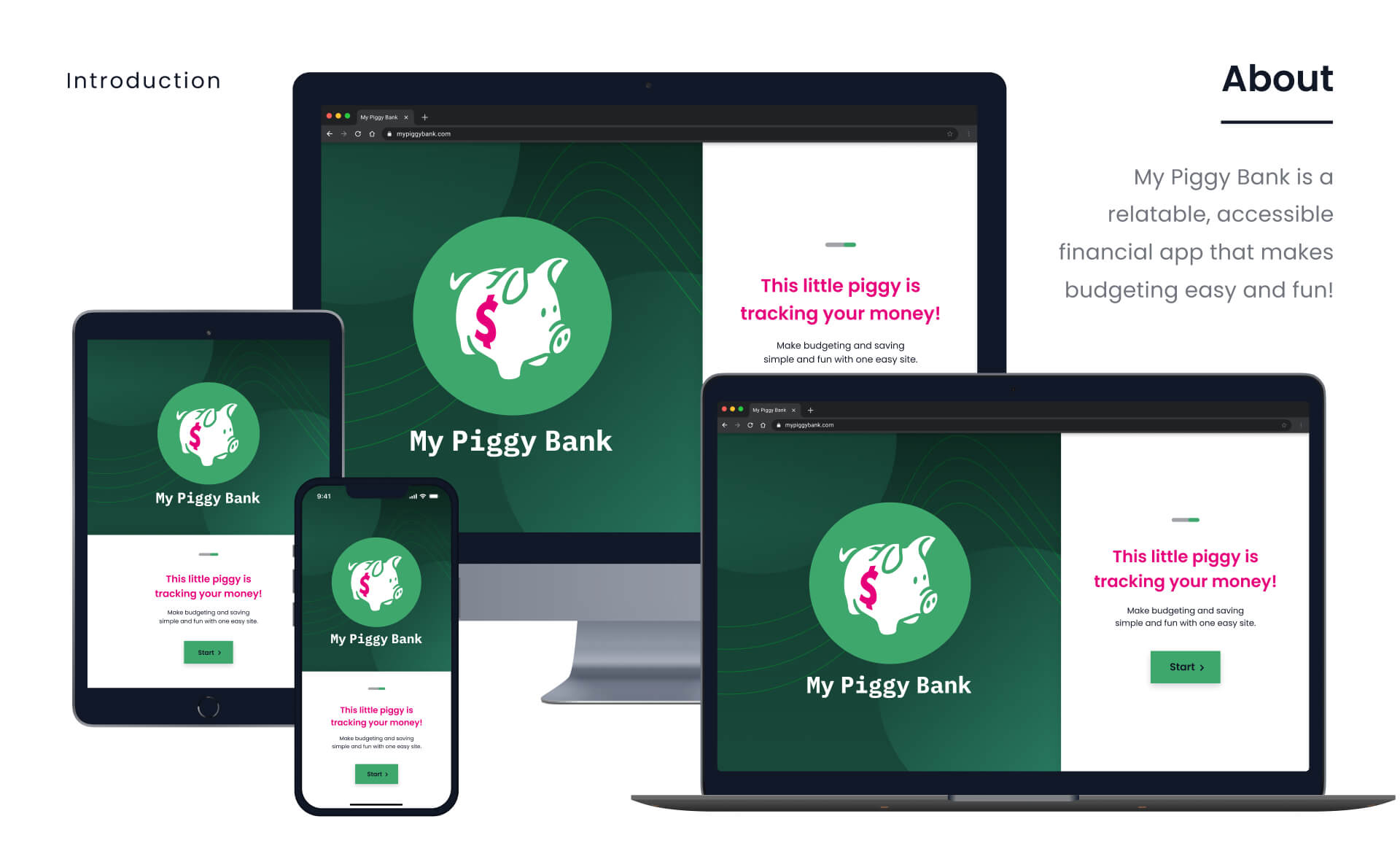
My Piggy Bank was started with a mobile first approach, but will eventually be scaled up to fit small (tablet), medium (laptop) and large (desktop) device screens.
logo:
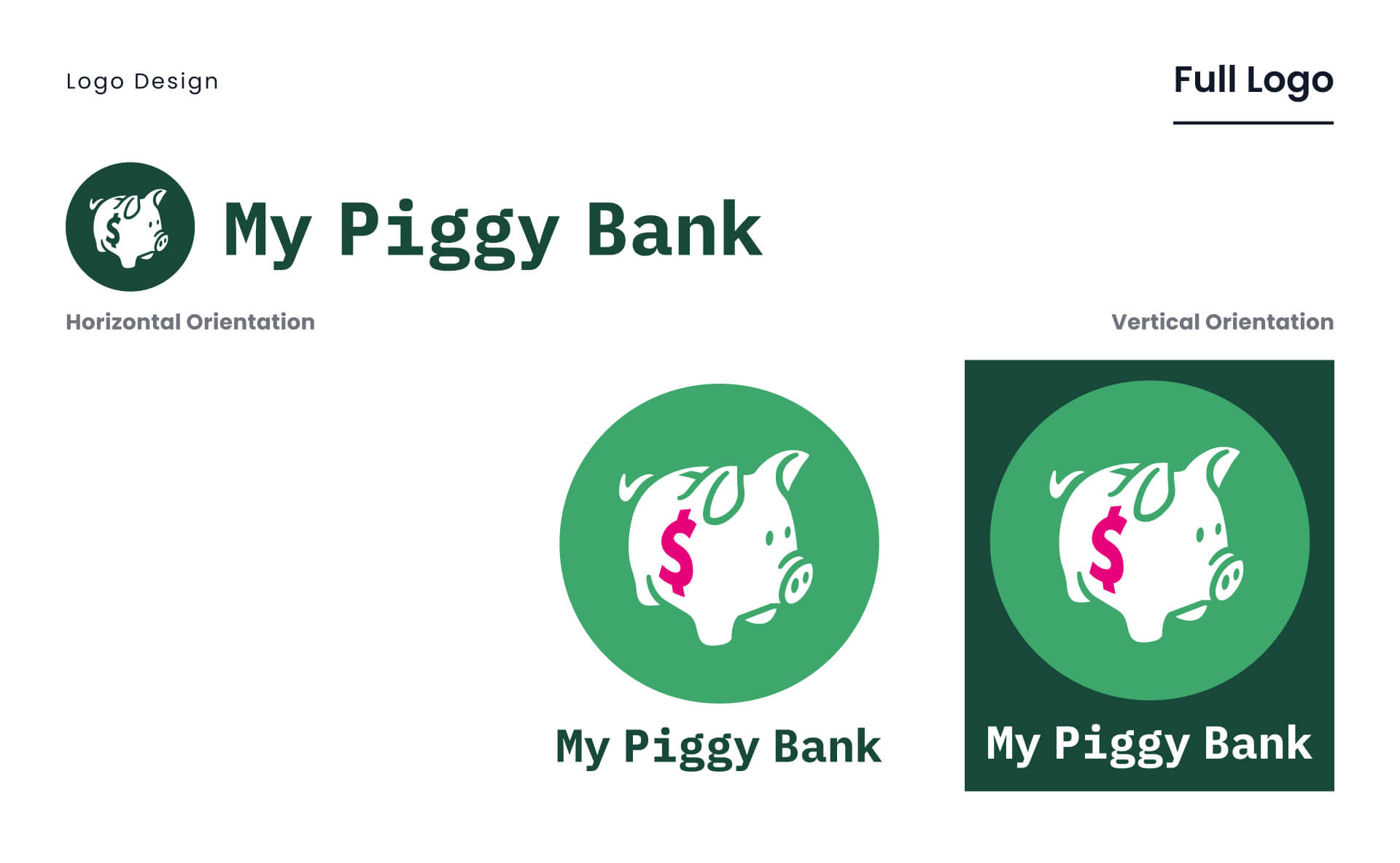
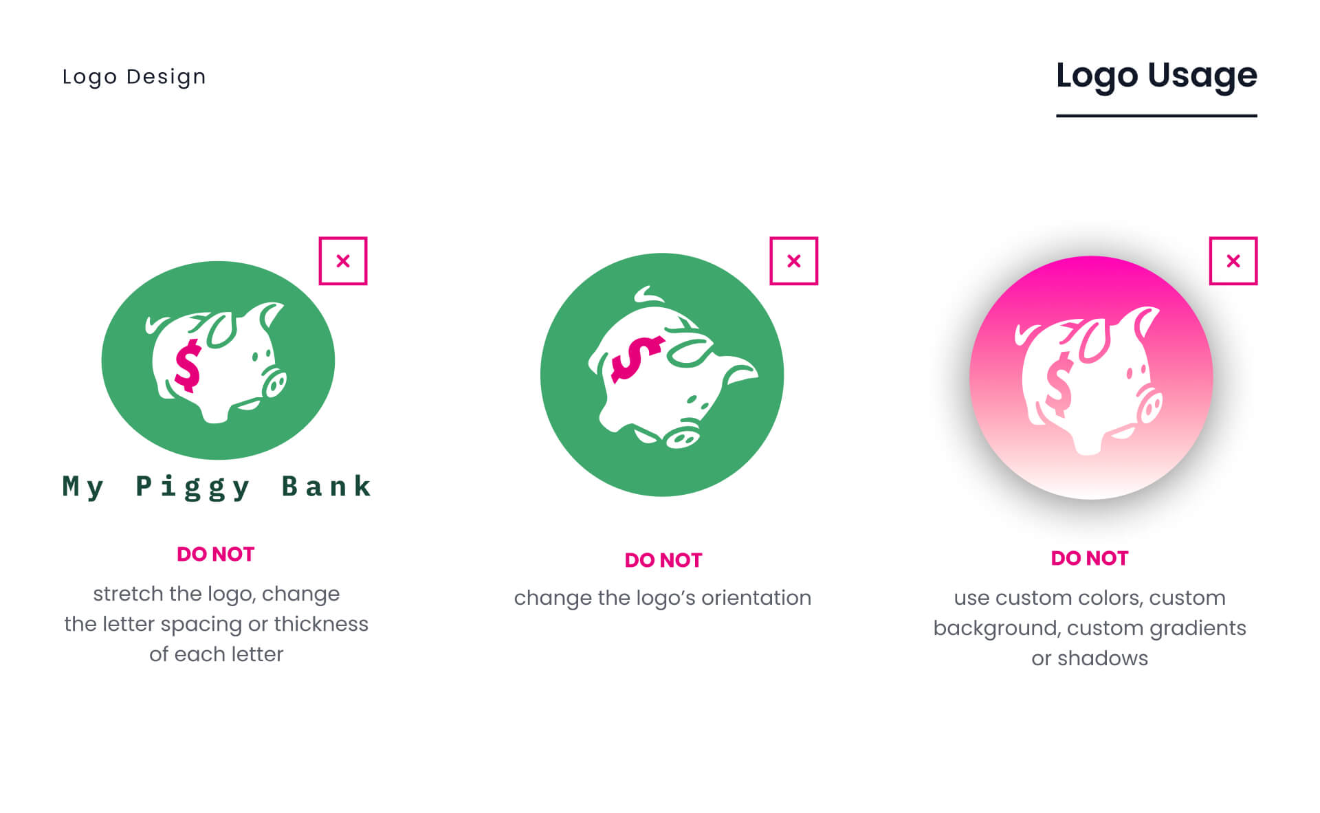
Since the goal of the website is easy money saving, the iconic 'piggy bank' from childhood became the primary icon.
colors:
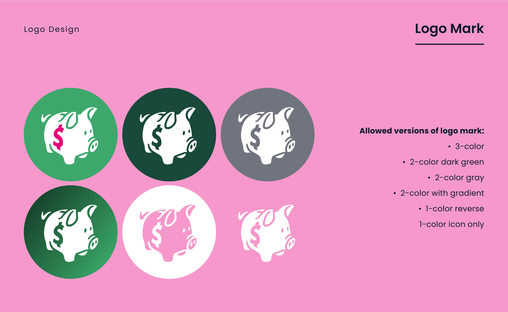
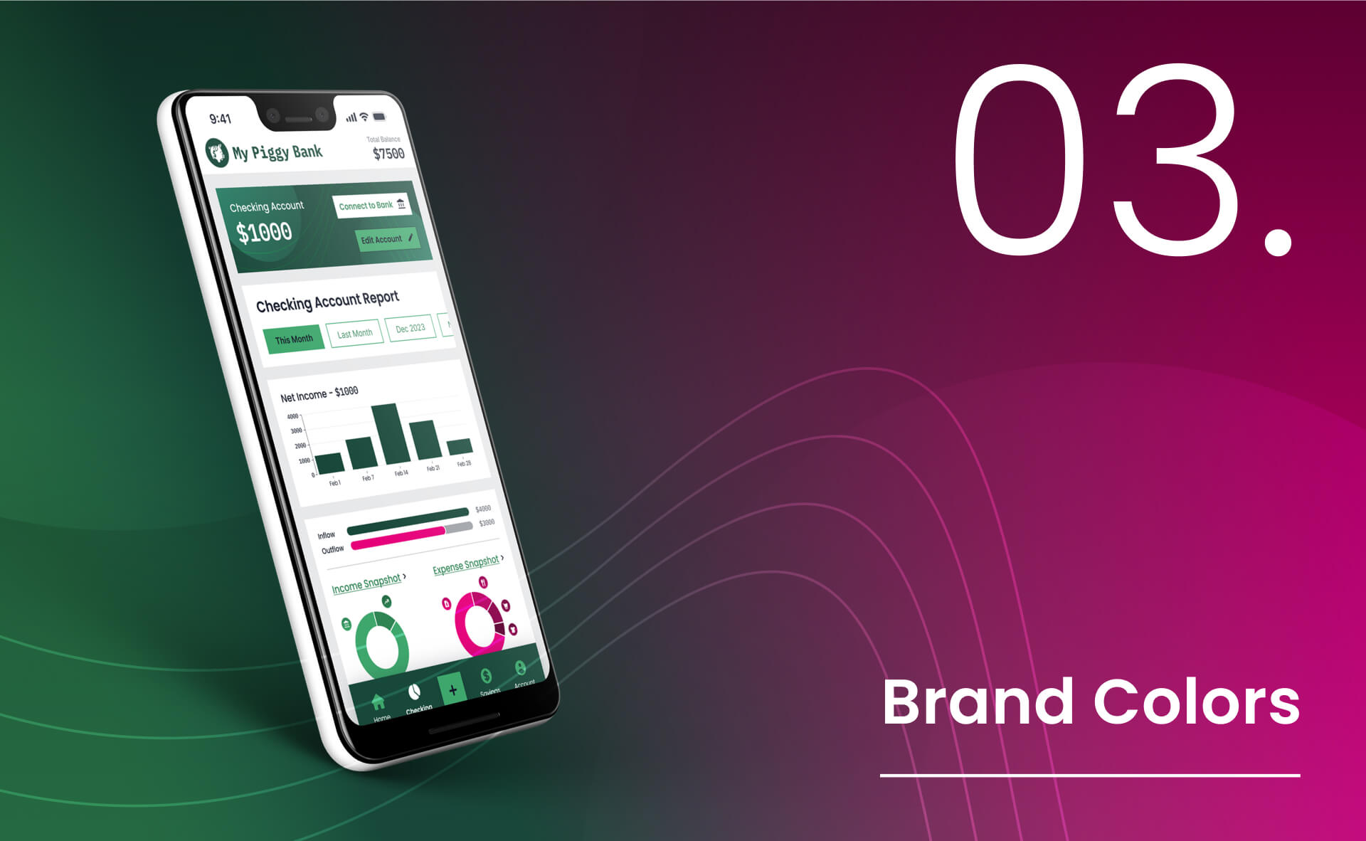
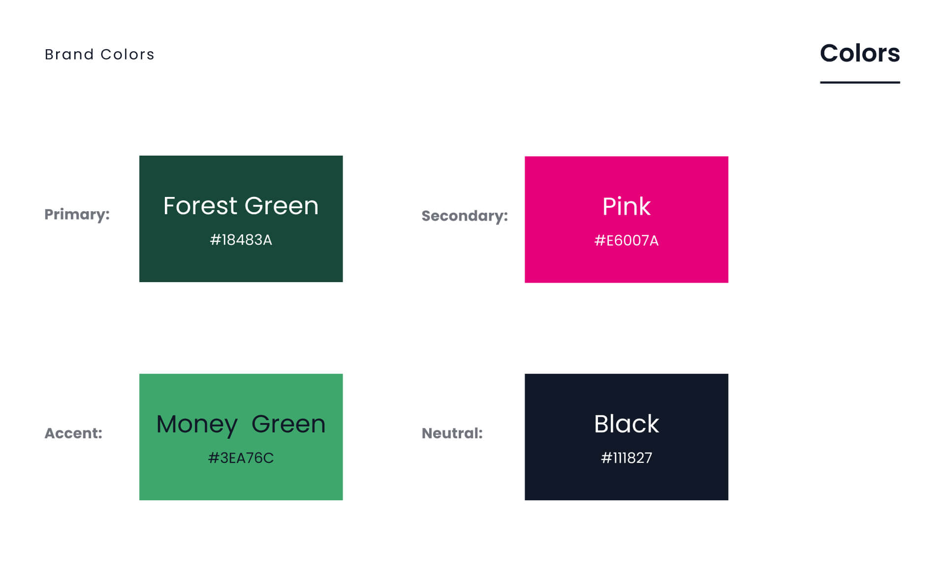
Shades of green are a no-brainer choice for an app about money. Pink makes sense with the piggy bank icon and for a warning color on expenses.
color accessibility:
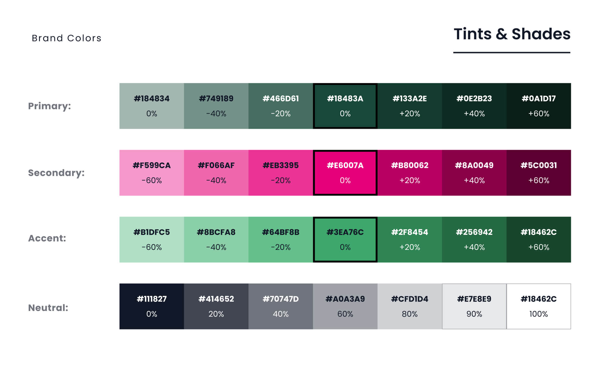
Tints and shades of each color ensure elements will have a passing WCAG contrast ratio while still staying within the overall brand identity’s color palette.
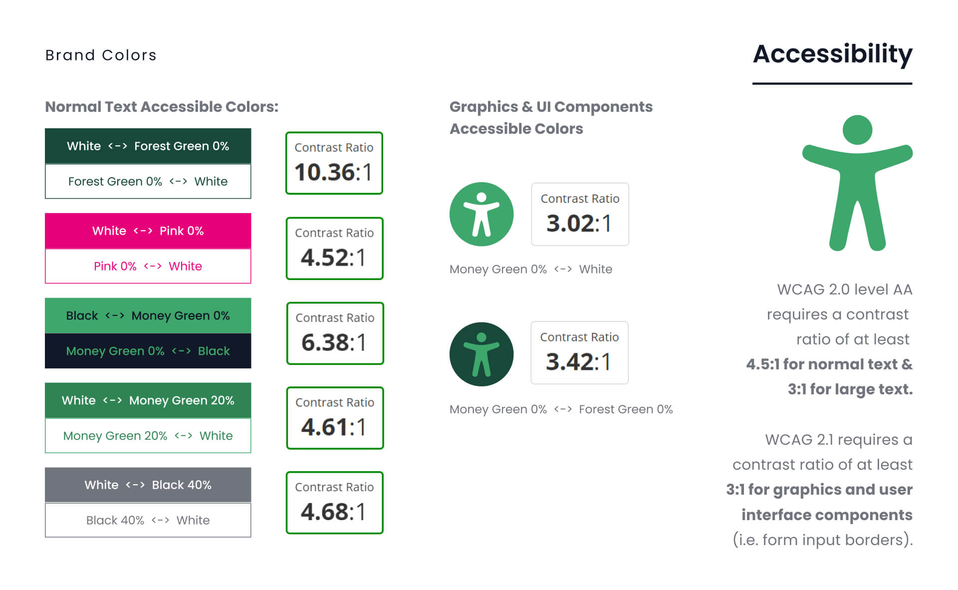
WCAG (Web Content Accessibility Guidelines) requires a
minimum ratio of color contrast between fonts or icons and their background to accomodate people with visual disabilities.
All colors in this app meet WCAG Level AA standards.
typography:
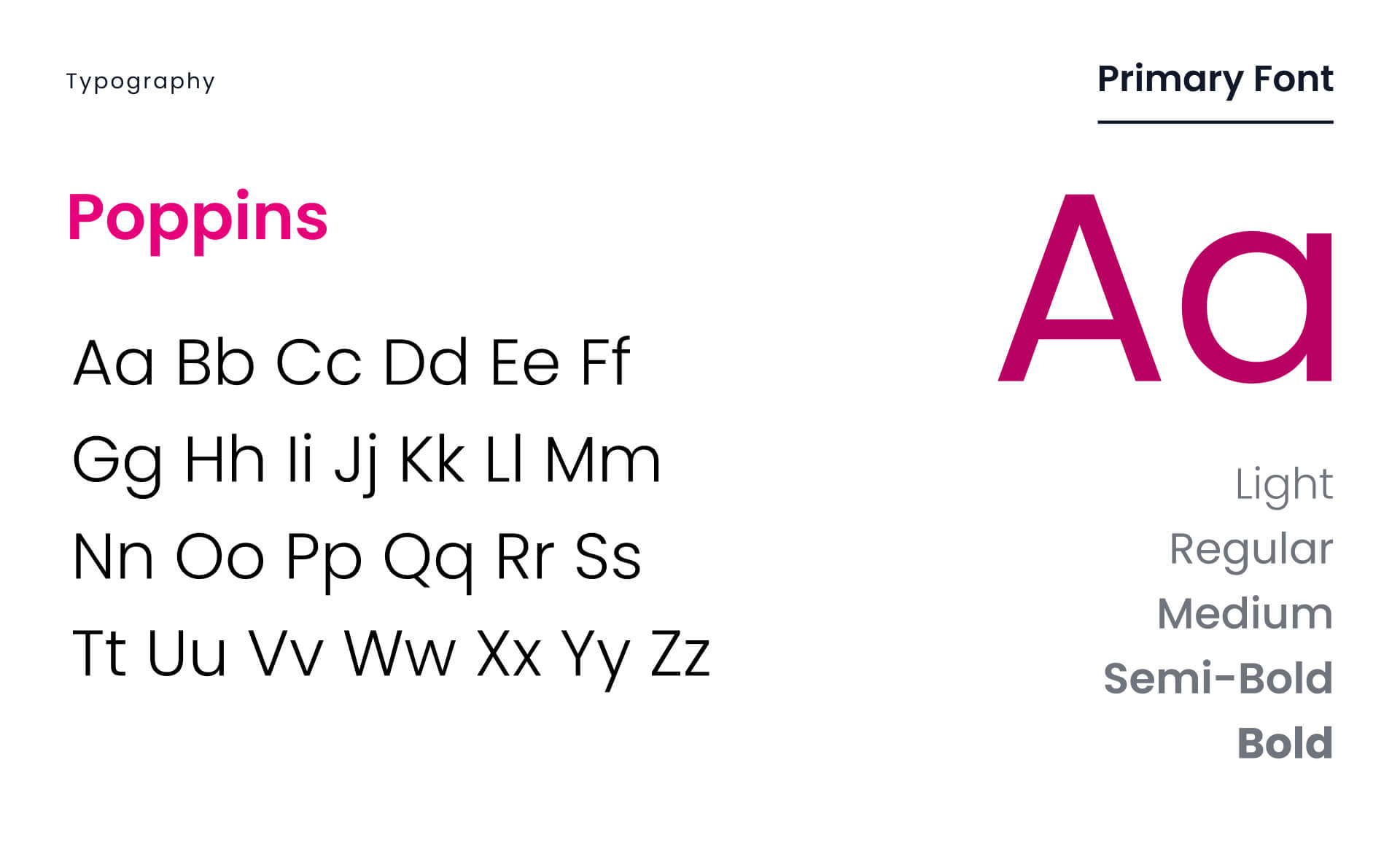
Poppins is a versatile, open-source font boasting clear letterforms and ample spacing. Perfect choice for an app aiming for ease of use!
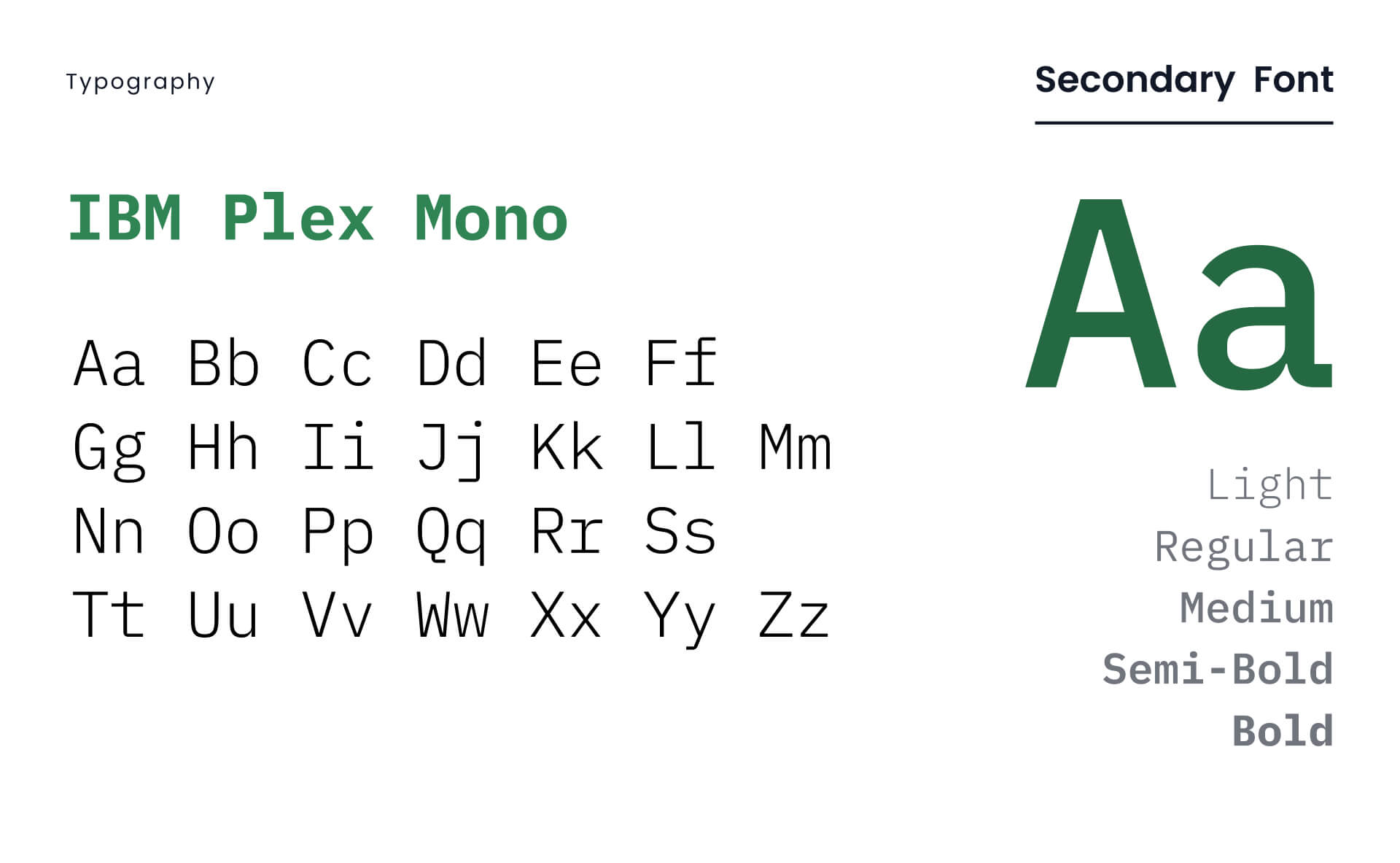
Plex is an international typeface with engineered details that call to mind a calculator. It was designed to illustrate the unique relationship between mankind and machine.
imagery:
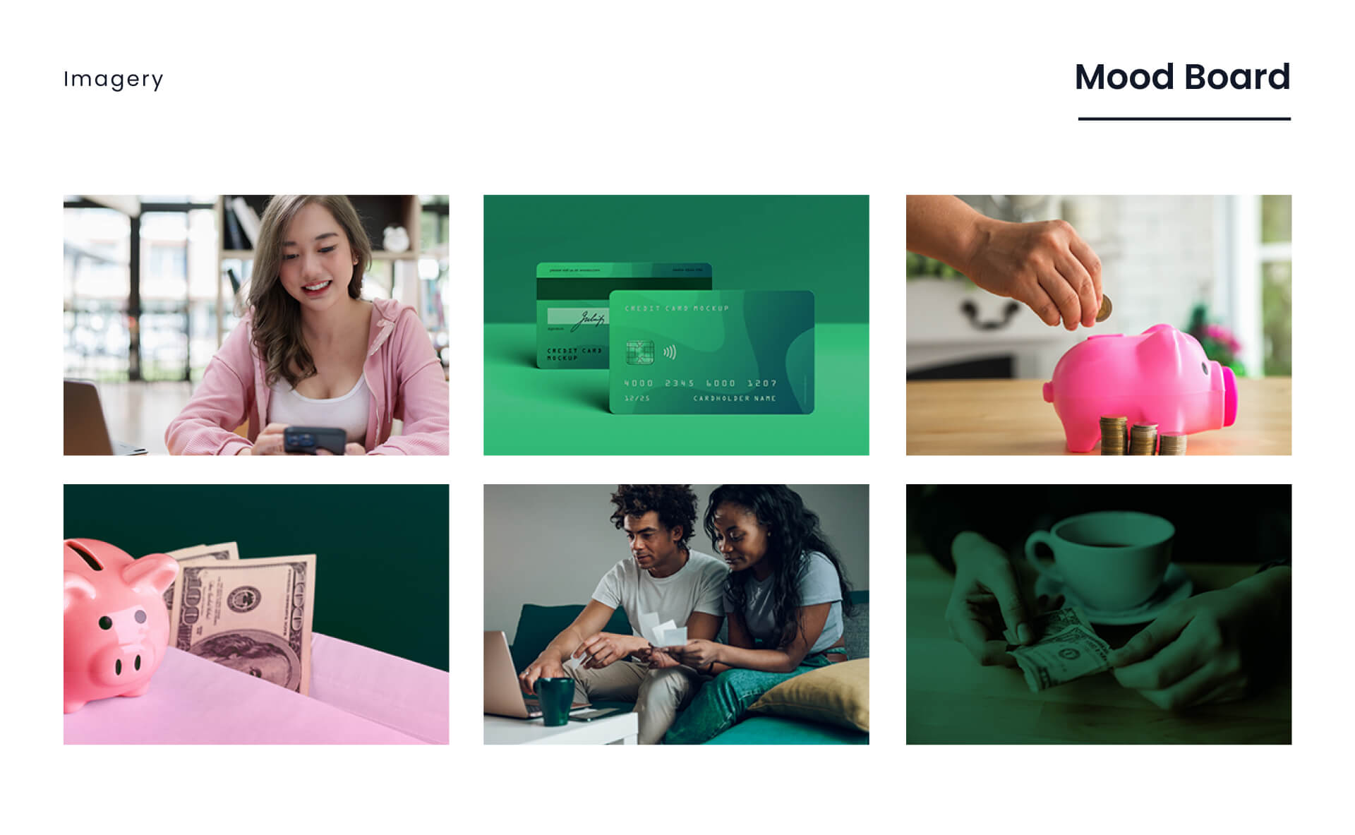
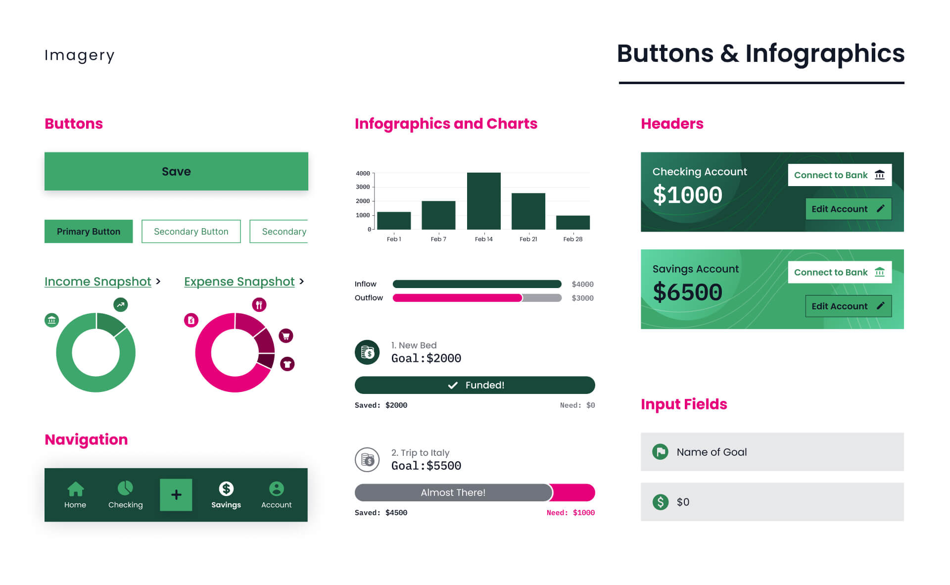
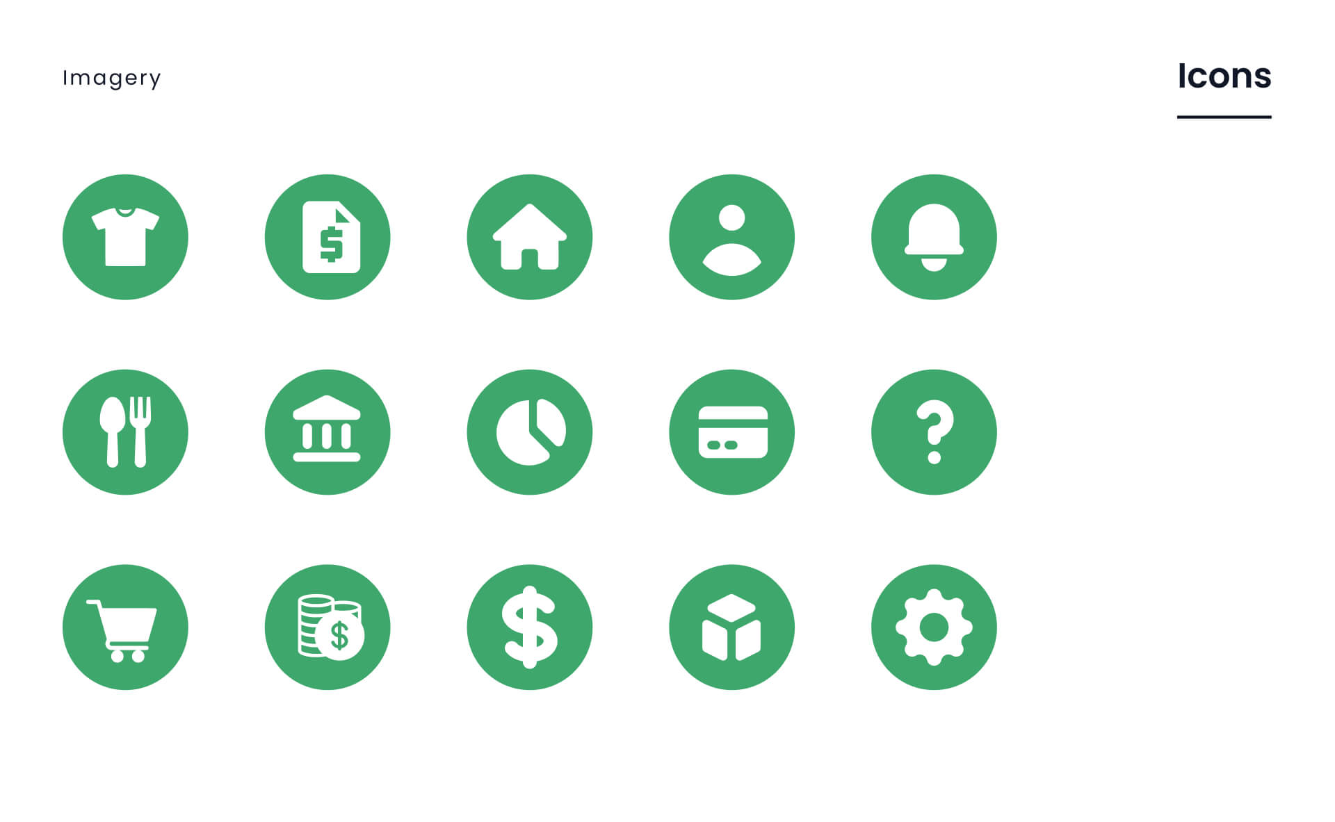
The brand imagery includes a mood board (representing the website's style and experience), plus custom designed buttons, infographics and icons.
user flow:
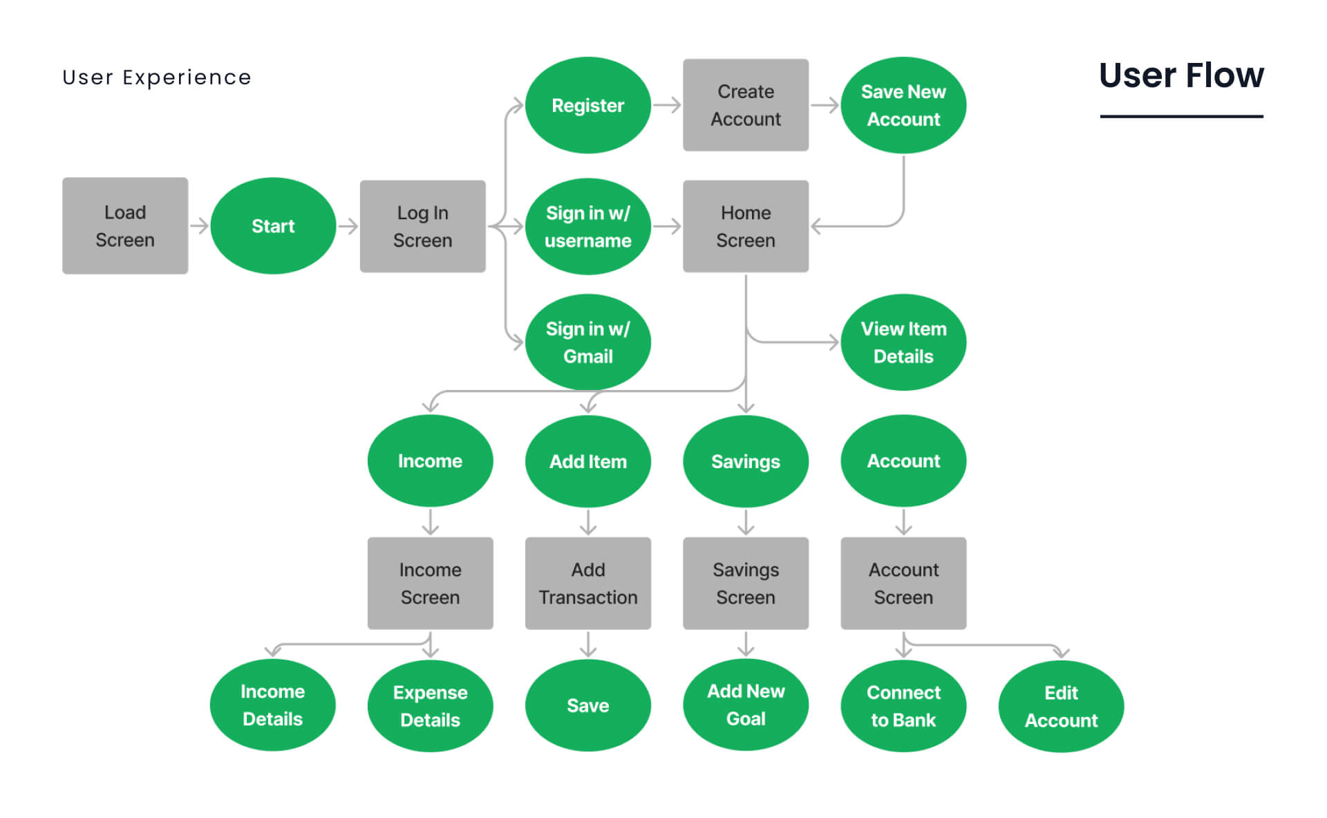
The flow chart was laid out with Jakob Nielsen's usability principles of Learnability, Efficency, Memorability, Errors and Satisfaction. Users can navigate the website smoothly and accomplish their goals without trouble .
user testing:
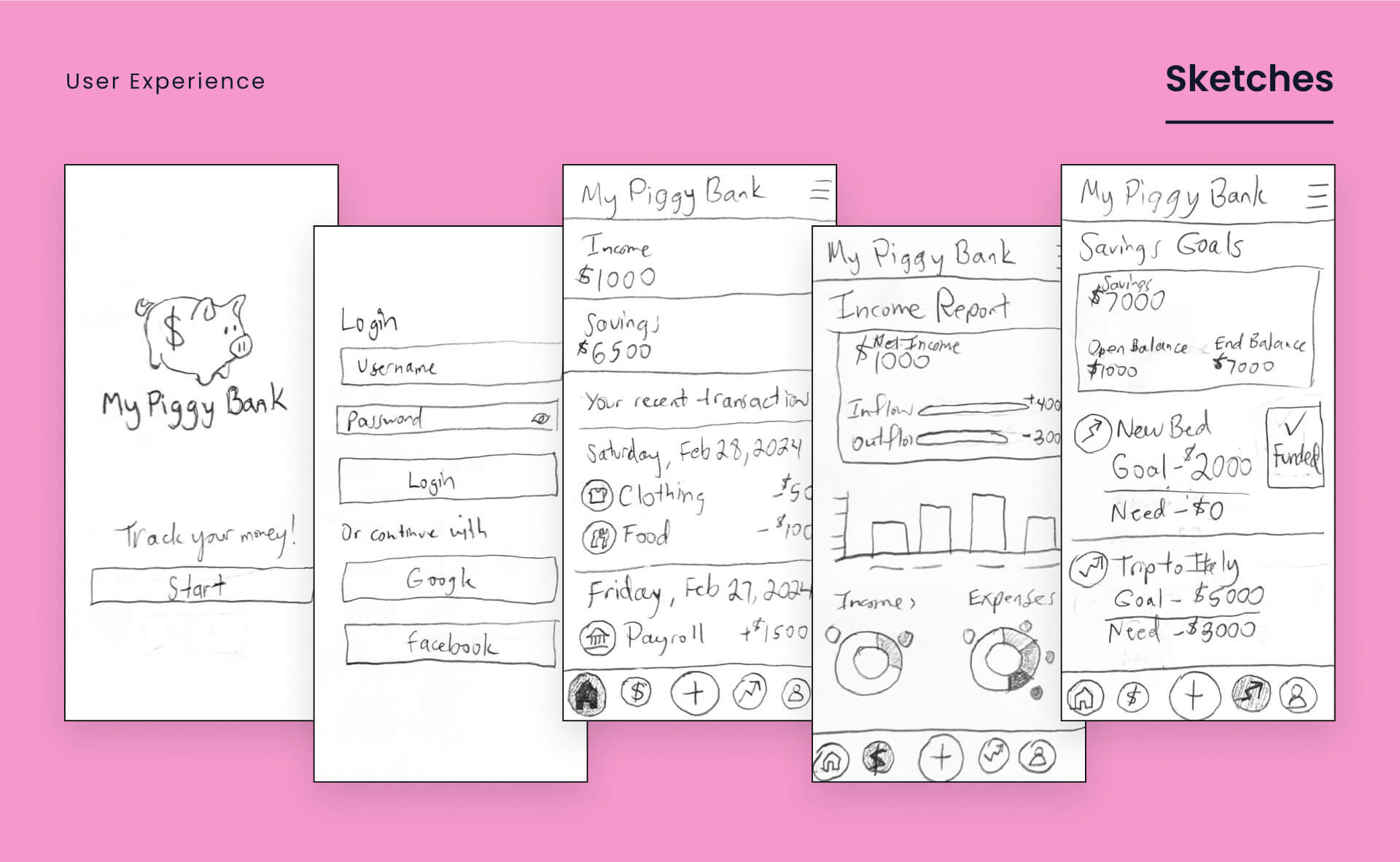
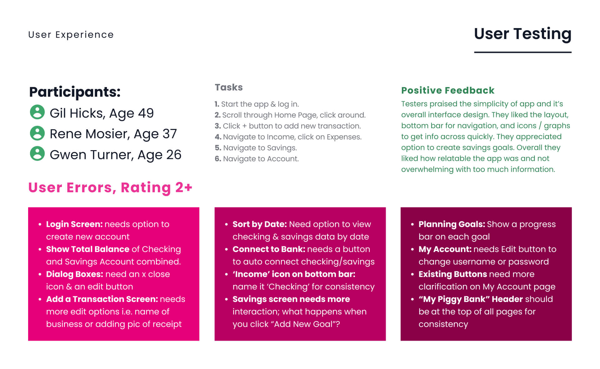
Working off of a sketched prototype, participants tested the app to provide essential feedback, pushing the app forward to more detailed wireframes.
user interface:
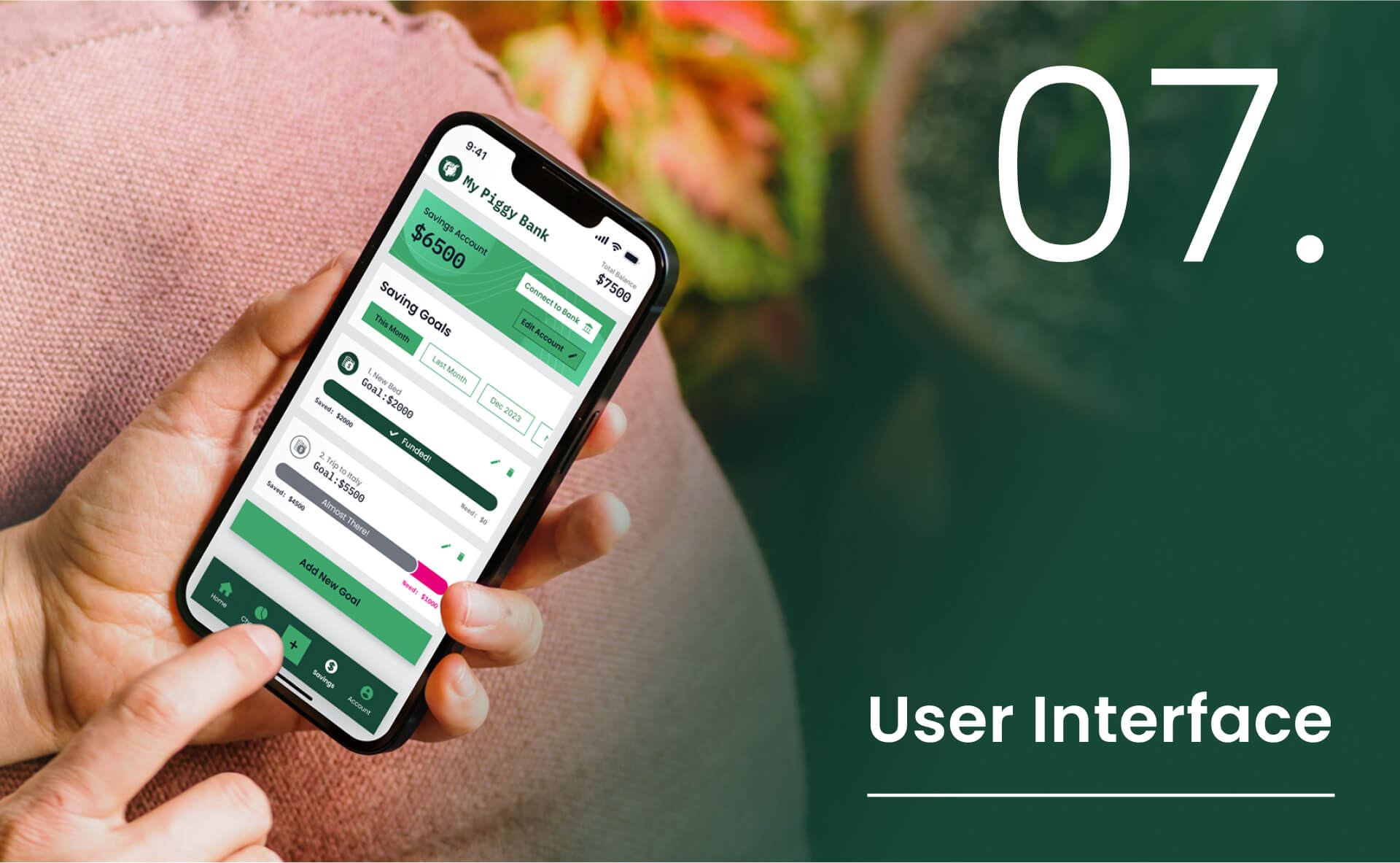
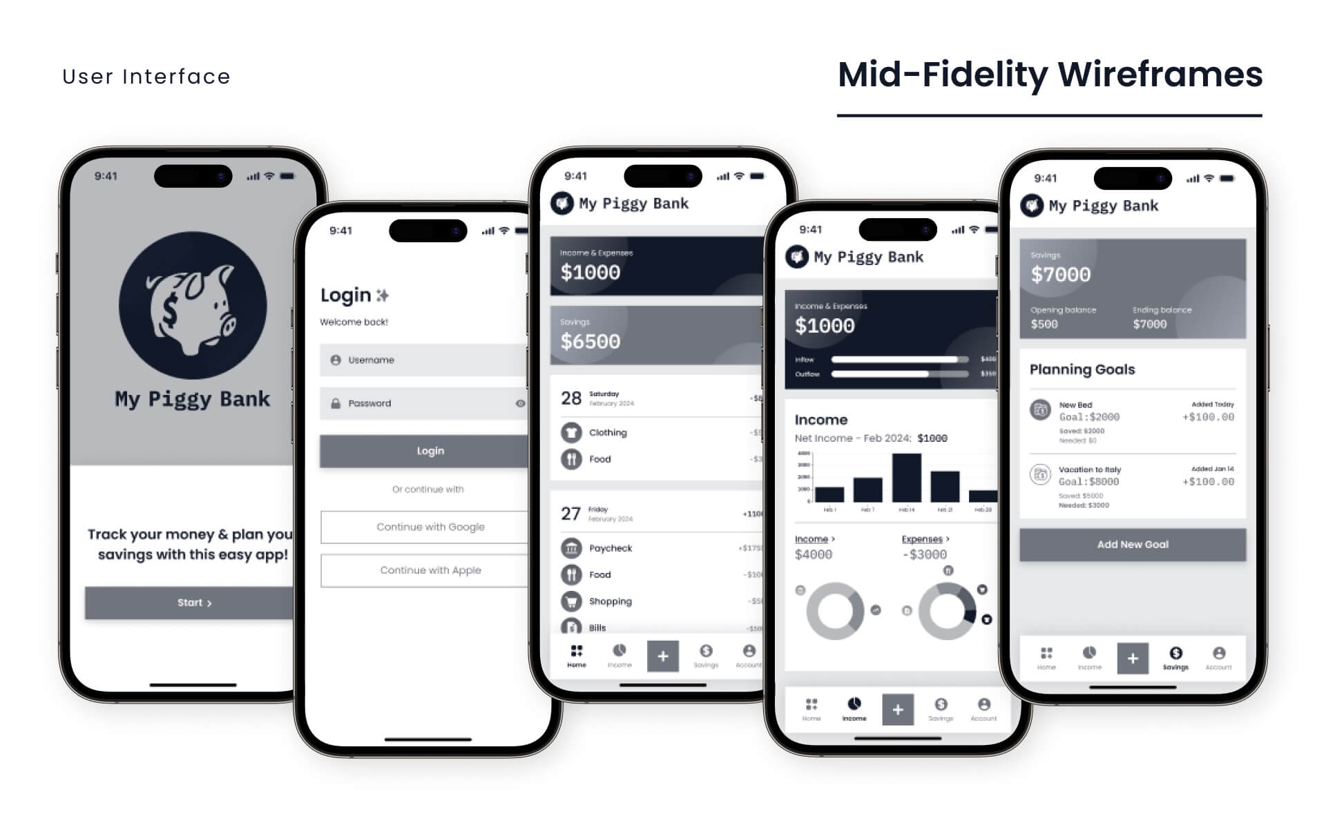
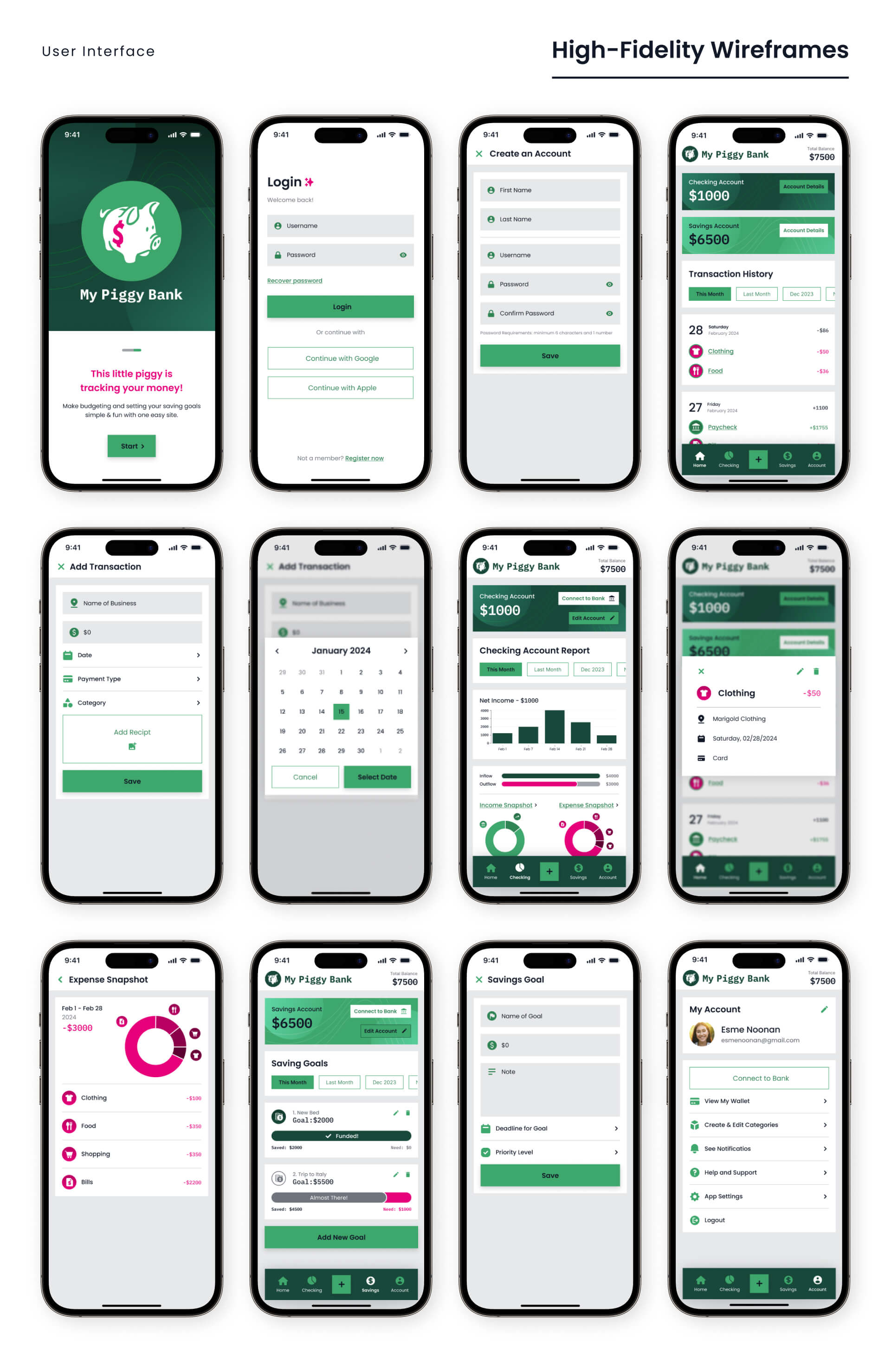
Grayscale wireframes were developed in Figma to establish the layout, then advanced to full-color detailed wireframes that closely resemble the final product.
breakpoints:
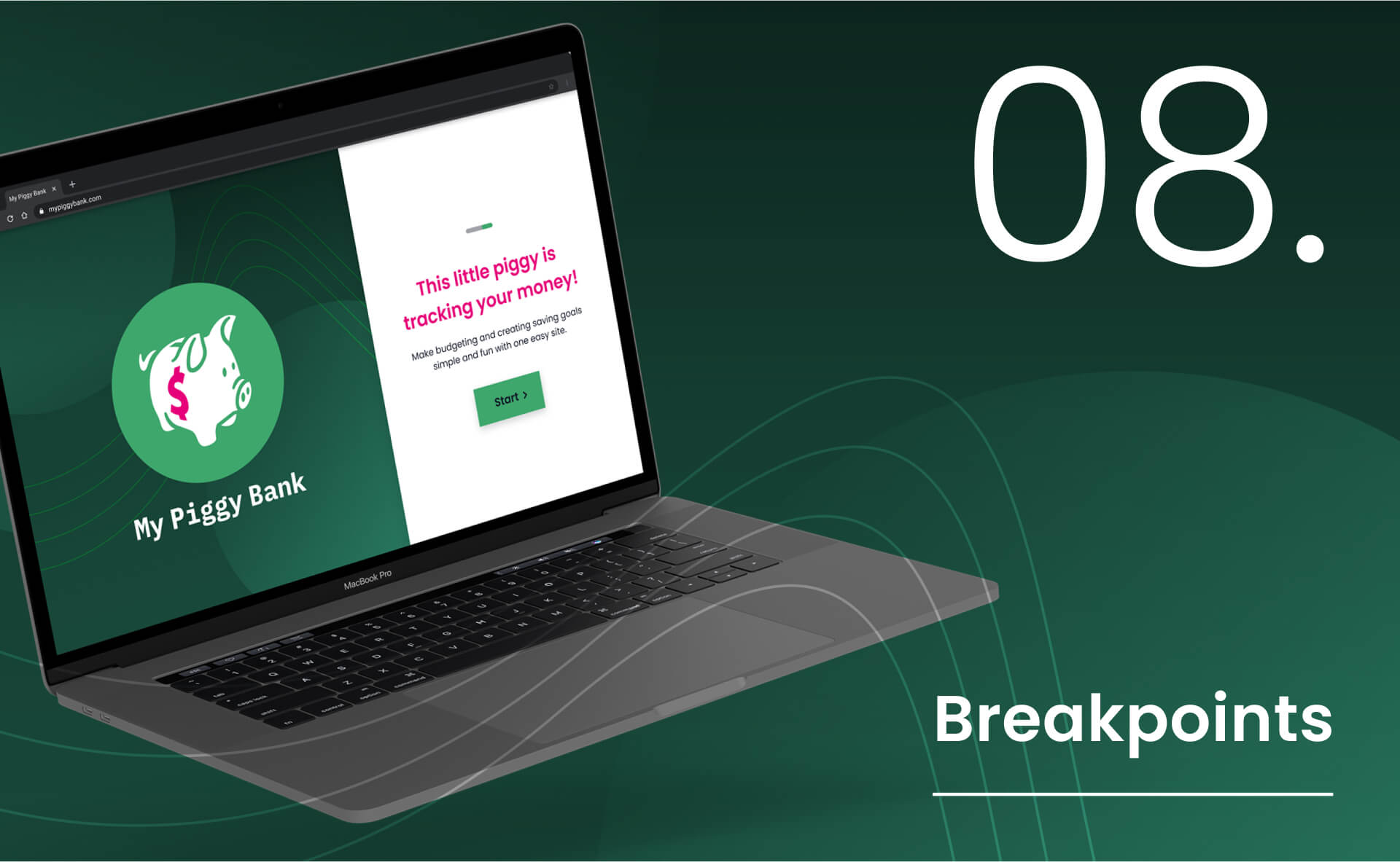
Breakpoints of the landing page show how the mobile design would expand to small, medium and large device screens.
