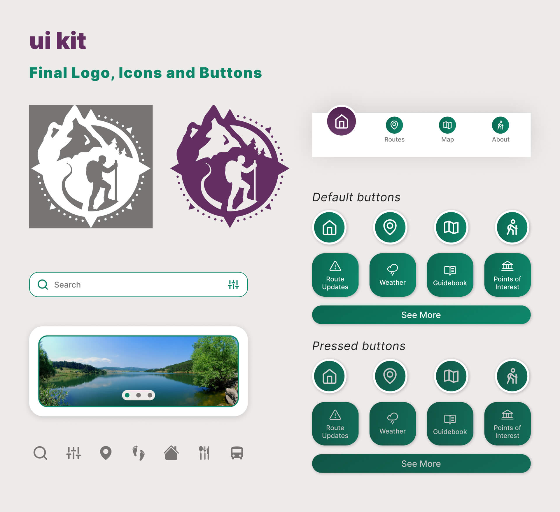
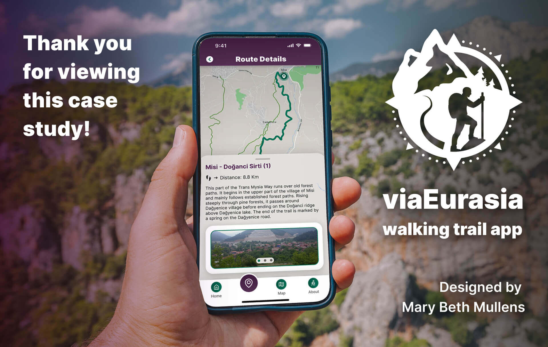
Case Study: ViaEurasia
walking trail app
Overview: Branding & UI Design of the mobile app for Via Eurasia, a historic hiking path from Europe to Asia. Created for a collaboration with CareerFoundry and the NGO Culture Routes Society.
Quicklinks: About | Project Brief | Logo | Colors | Wireframes & Prototype | UI Kit
about Via Eurasia:
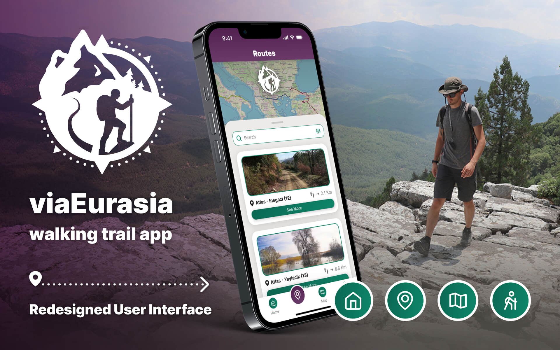
The Via Eurasia is a series of long distance hiking trails linking Eastern Europe to Western Asia, using ancient historic routes and paths. The trail system was developed by Turkey’s Culture Routes Society and funded by the European Union.
project brief:
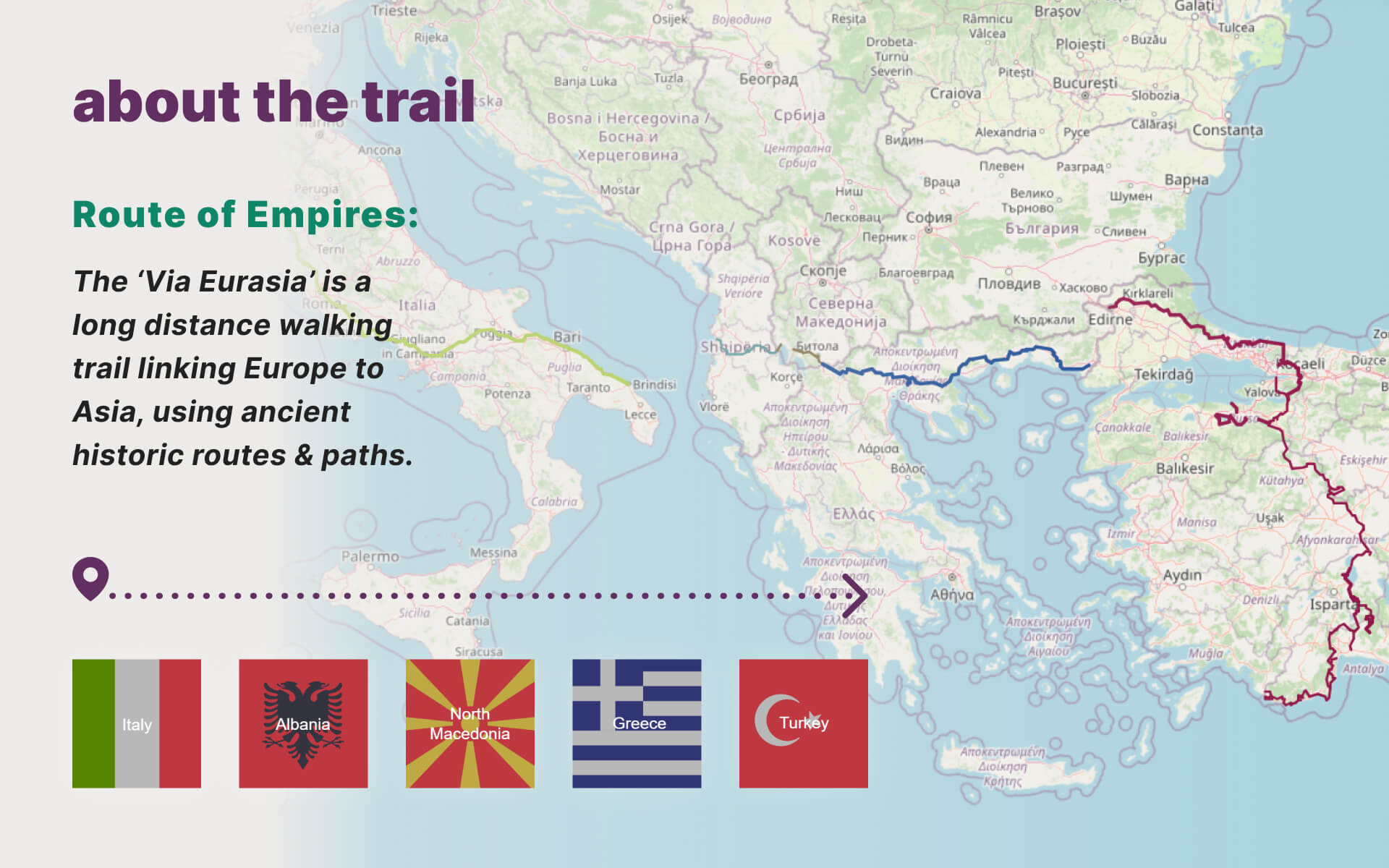
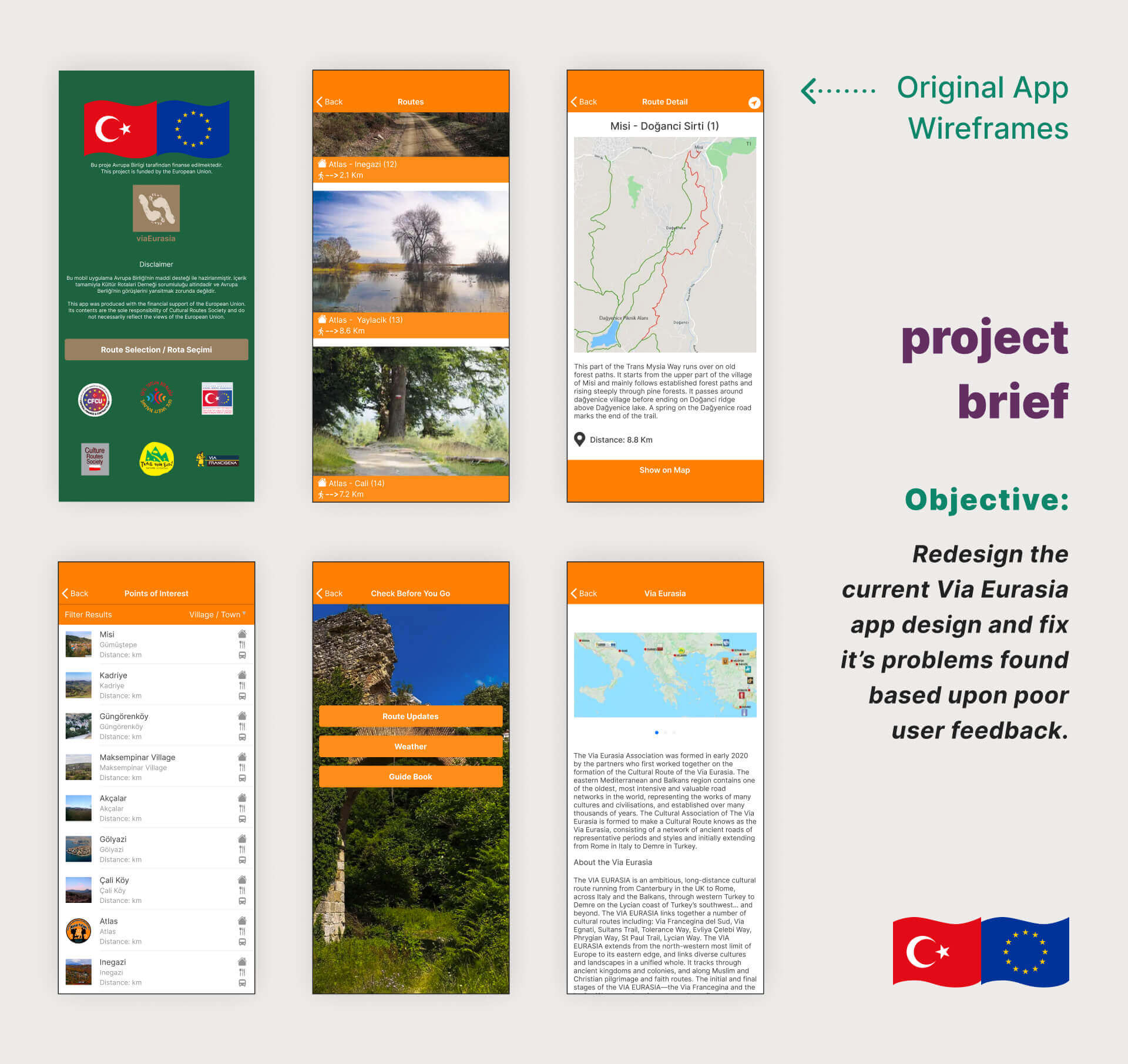
The Culture Routes Society requested a redesign of their intial app to fix many problems based on poor user feedback:
1. Outdated logo and branding
2. Colors not accessible
3. Confusing navigation
4. More screens than necessary
5. Text needs better hierarchy
6. “Home” page looks like legal document
7. “About” page lacks visual appeal
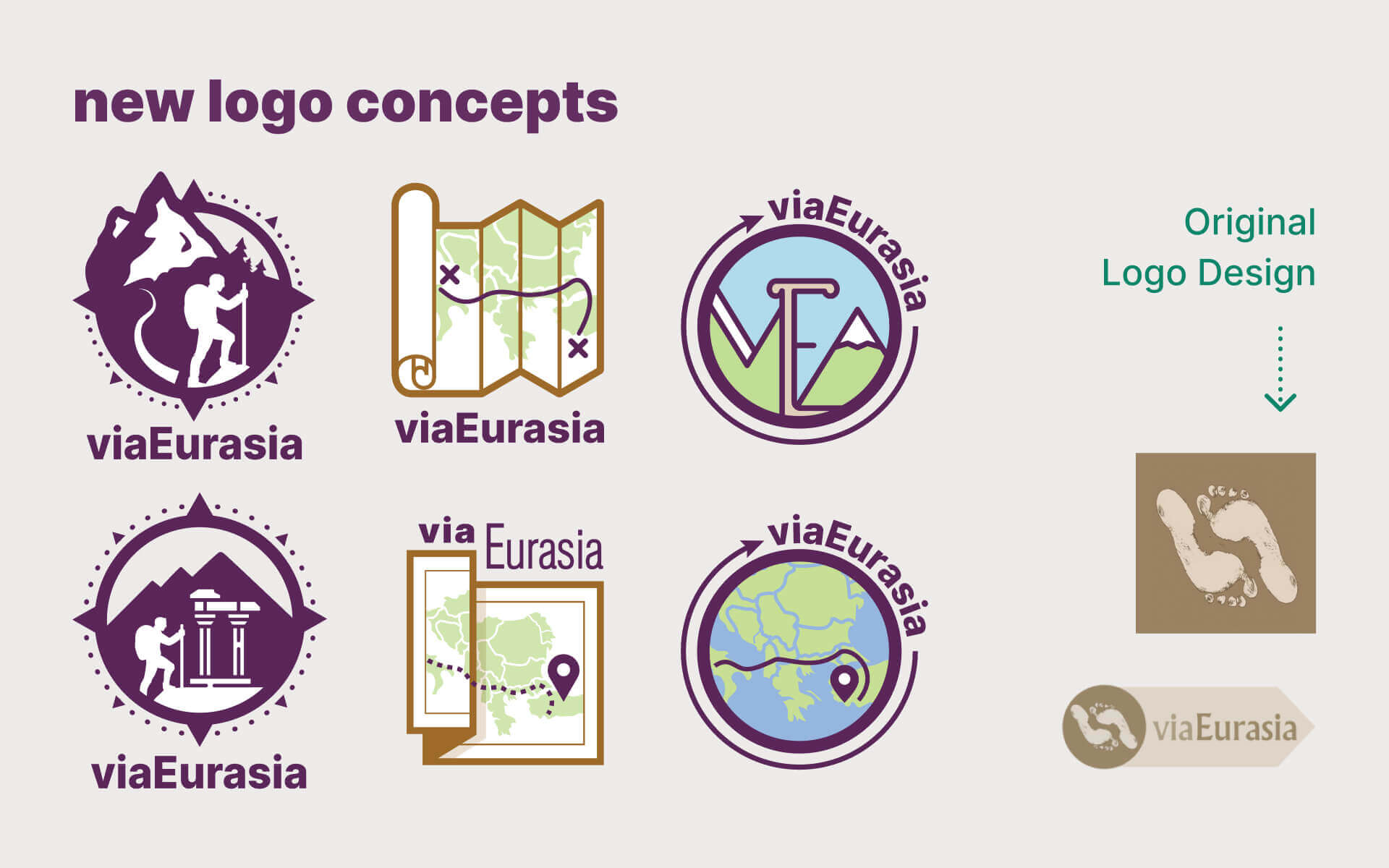
new logo concepts:
Their original logo was a pair of footprints representing ancient travelers who once walked barefoot on these paths. However, this idea is unclear unless explained, and the old logo lacks visual appeal.
The new logo design options convey the concept of the trail/app quicker plus refine the overall look.
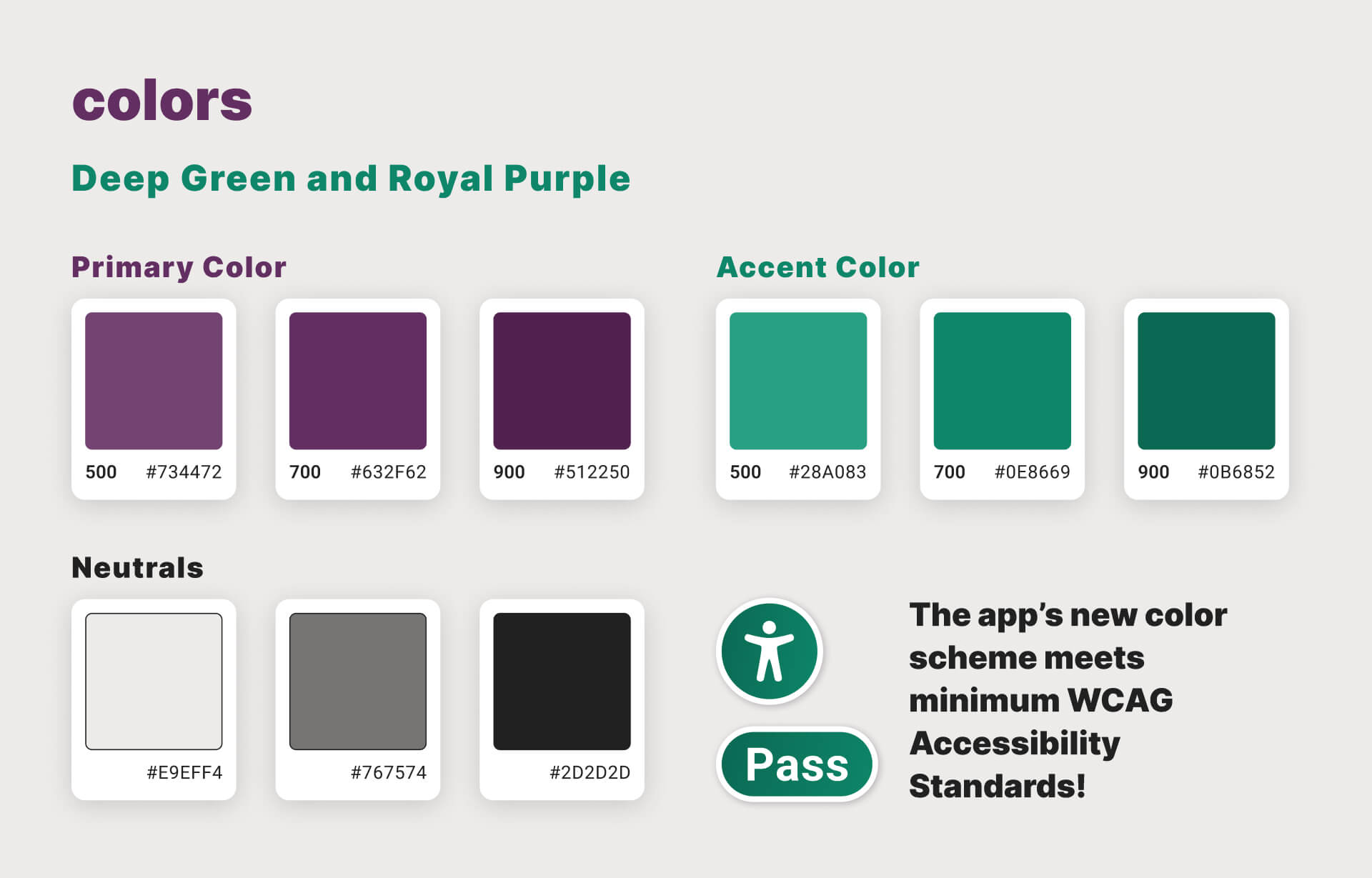
colors:
Green was chosen to emanate the outdoors and purple to represent the grandeur of these historic routes.
They contrast properly when applied with type and backgrounds to meet the WCAG (Web Content Accessibility Guidelines) standards.
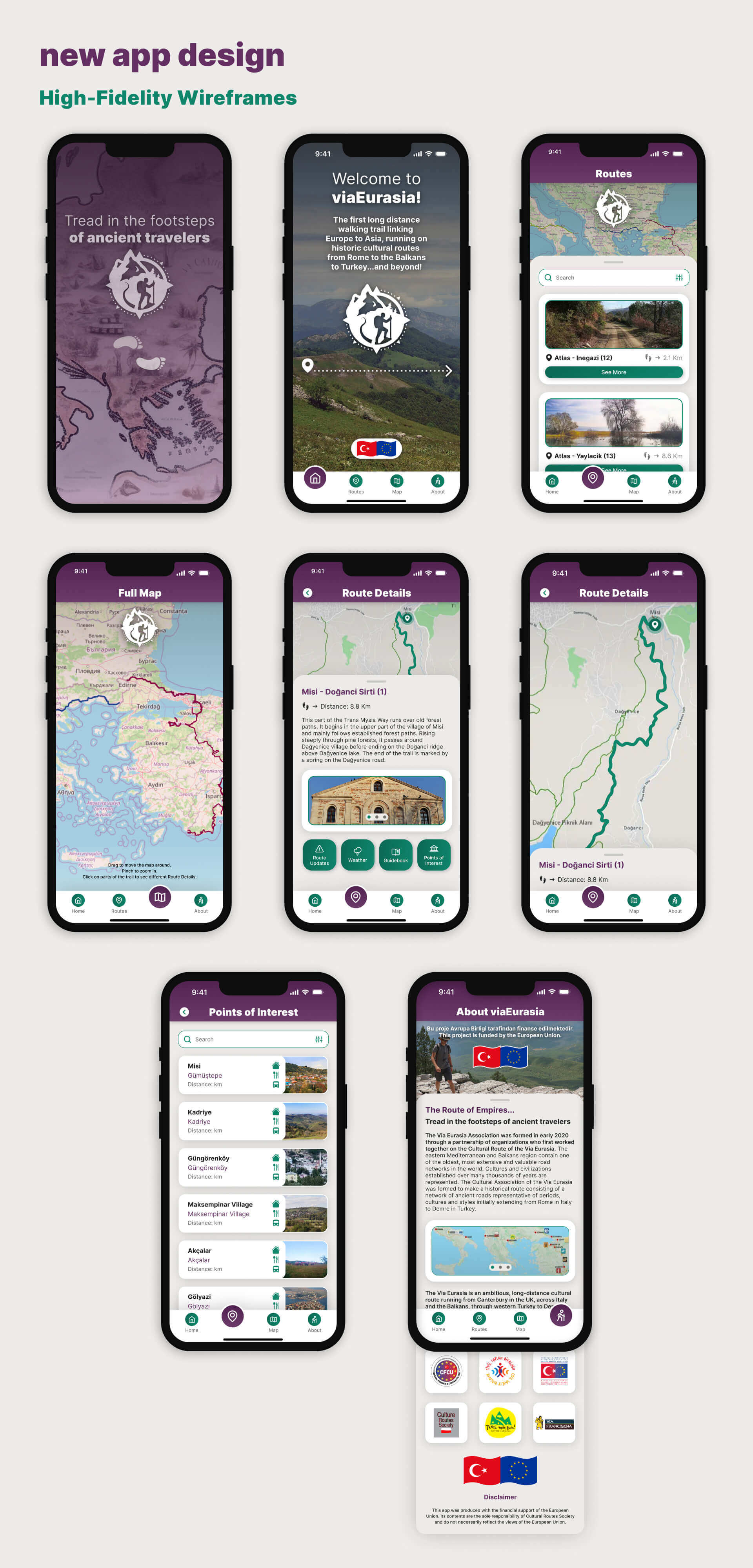
high-fidelity wireframes:
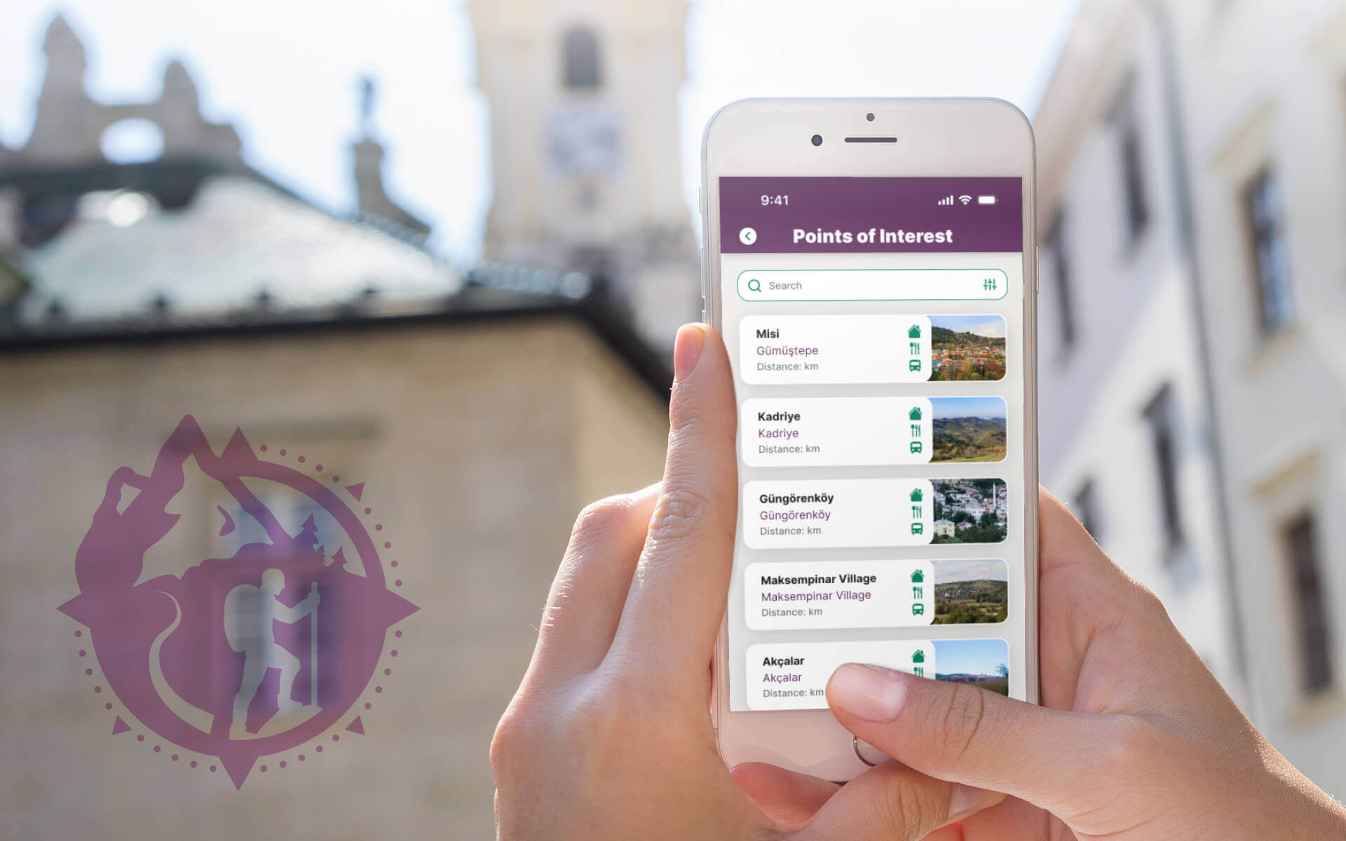
A realistic prototype was created in Figma, including many interactive elements.
Click the button below to take a walk through the app design:
user interface kit:
The final assets were compiled into a UI kit and exported into proper file formats for The Culture Routes Society to use once they receive the necessary funding to redevelop their app.
